The Modern Guide For Making CSS Shapes
You have for sure googled “how to create [shape_name] with CSS” at least once in your front-end career if it’s not something you already have bookmarked. And the number of articles and demos you will find out there is endless.
Good, right? Copy that code and drop it into the ol’ stylesheet. Ship it!
The problem is that you don’t understand how the copied code works. Sure, it got the job done, but many of the most widely used CSS shape snippets are often dated and rely on things like magic numbers to get the shapes just right. So, the next time you go into the code needing to make a change to it, it either makes little sense or is inflexible to the point that you need an entirely new solution.
So, here it is, your one-stop modern guide for how to create shapes in CSS! We are going to explore the most common CSS shapes while highlighting different CSS tricks and techniques that you can easily re-purpose for any kind of shape. The goal is not to learn how to create specific shapes but rather to understand the modern tricks that allow you to create any kind of shape you want.
Table of Contents
You can jump directly to the topic you’re interested in to find relevant shapes or browse the complete list. Enjoy!
- Hexagons
- Octagons
- Stars
- Polygons & Starbursts
- Parallelograms & Trapezoids
- Circles & Holes
- Border Edges
- Rounded Arcs
- Dashed Circles
- Rounded Tabs
- Triangles
- Hearts
- Ribbons
- Tooltips & Speech Bubbles
- Cutting Corners
- Cut-Out Shapes
- Section Dividers
- Inner Curves
- Floral Shapes
- Wavy & Zig-Zag Boxes
Why Not SVG?
I get asked this question often, and my answer is always the same: Use SVG if you can! I have nothing against SVG. It’s just another approach for creating shapes using another syntax with another set of considerations. If SVG was my expertise, then I would be writing about that instead!
CSS is my field of expertise, so that’s the approach we’re covering for drawing shapes with code. Choosing CSS or SVG is typically a matter of choice. There may very well be a good reason why SVG is a better fit for your specific needs.
Many times, CSS will be your best bet for decorative things or when you’re working with a specific element in the markup that contains real content to be styled. Ultimately, though, you will need to consider what your project’s requirements are and decide whether a CSS shape is really what you are looking for.
Your First Resource
Before we start digging into code, please spend a few minutes over at my CSS Shape website. You will find many examples of CSS-only shapes. This is an ever-growing collection that I regularly maintain with new shapes and techniques. Bookmark it and use it as a reference as we make our way through this guide.
Is it fairly easy to modify and tweak the CSS for those shapes?
Yes! The CSS for each and every shape is optimized to be as flexible and efficient as possible. The CSS typically targets a single HTML element to prevent you from having to touch too much markup besides dropping the element on the page. Additionally, I make liberal use of CSS variables that allow you to modify things easily for your needs.
Most of you don’t have time to grasp all the techniques and tricks to create different shapes, so an online resource with ready-to-use snippets of code can be a lifesaver!
Clipping Shapes In CSS
The CSS clip-path property — and its polygon() function — is what we commonly reach for when creating CSS Shapes. Through the creation of common CSS shapes, we will learn a few tricks that can help you create other shapes easily.
Hexagons
Let’s start with one of the easiest shapes; the hexagon. We first define the shape’s dimensions, then provide the coordinates for the six points and we are done.
.hexagon {
  width: 200px;
  aspect-ratio: 0.866;
  clip-path: polygon(
    0% 25%,
    0% 75%,
    50% 100%,
    100% 75%,
    100% 25%,
    50% 0%);
}
See the Pen [Hexagon shape using clip-path](https://codepen.io/t_afif/pen/JjVJJbG) by Temani Afif.
Easy, right? But what if I told you that there’s an even easier way to do it? Instead of six points, we can get by with just four.
A little-known trick with the polygon() function is that we are allowed to set points that are outside the [0% 100%] range. In other words, we can cut outside the element — which becomes super useful for this shape as well many others, as we’ll see.
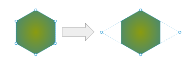
We’re basically drawing the shape of a diamond where two of the points are set way outside the bounds of the hexagon we’re trying to make. This is perhaps the very first lesson for drawing CSS shapes: Allow yourself to think outside the box — or at least the shape’s boundaries.
Look how much simpler the code already looks:
.hexagon {
  width: 200px;
  aspect-ratio: cos(30deg);
  clip-path: polygon(
    -50% 50%,
    50% 100%,
    150% 50%,
    50% 0
  );
}
Did you notice that I updated the aspect-ratio property in there? I’m using a trigonometric function, cos(), to replace the magic number 0.866. The exact value of the ratio is equal to cos(30deg) (or sin(60deg)). Besides, cos(30deg) is a lot easier to remember than 0.866.
Here’s something fun we can do: swap the X and Y coordinate values. In other words, let’s change the polygon() coordinates from this pattern:
clip-path: polygon(X1 Y1, X2 Y2, ..., Xn Yn)
…to this, where the Y values come before the X values:
clip-path: polygon(Y1 X1, Y2 X2, ..., Yn Xn)
What we get is a new variation of the hexagon:
See the Pen [Another variation of the hexagon shape](https://codepen.io/t_afif/pen/BaEZrrP) by Temani Afif.
Swapping the X and Y values will make a kind of switch between the vertical and horizontal axes, which will help to get a different shape. Note that I have also updated the ratio to 1/cos(30deg) instead of cos(30deg). Since we are switching both axes, the new ratio needs to be equal to its inverse, i.e., R (or R/1) becomes 1/R.
And since our CSS is nothing more than a single style rule on a single selector, we can apply it to more than a <div>. For example, the following demo includes both variations of the original hexagon, plus a third example that sets the styles on an <img> element.
See the Pen [CSS-only hexagon shapes (the modern way)](https://codepen.io/t_afif/pen/KKEMjxV) by Temani Afif.
There we go, our first shape! We are also walking away with two valuable lessons about creating shapes with CSS:
- The
polygon()function accepts points outside the[0% 100%]range.
This allows us to clip shapes with fewer points in some cases but also opens up possibilities for creating additional shapes. - Switching axes is a solid approach for creating shape variations.
In the case of a hexagon, swapping the values on the X and Y axes changes the hexagon’s direction.
Octagons
An octagon is another geometric shape and it is very close in nature to the hexagon. Instead of working with six sides, we’re working with eight to get what looks like the shape of a common traffic stop sign.
Let’s take the first lesson we learned from working with hexagons and clip the element with coordinates outside the shape’s boundaries to keep our clipping efficient. Believe it or not, we can actually establish all eight octagon sides with only four points, just like we used only four points to establish the hexagon’s six sides.
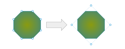
I know that visualizing the shape with outside points can be somewhat difficult because we’re practically turning the concept of clipping on its head. But with some practice, you get used to this mental model and develop muscle memory for it.
Notice that the CSS is remarkably similar to what we used to create a hexagon:
.octagon {
  width: 200px;
  aspect-ratio: 1;
  --o: calc(50% * tan(-22.5deg));
  clip-path: polygon(
    var(--o) 50%,
    50% var(--o),
    calc(100% - var(--o)) 50%,
    50% calc(100% - var(--o))
  );
}
Except for the small trigonometric formula, the structure of the code is identical to the last hexagon shape — set the shape’s dimensions, then clip the points. And notice how I saved the math calculation as a CSS variable to avoid repeating that code.
If math isn’t really your thing — and that’s totally fine! — remember that the formulas are simply one part of the puzzle. There’s no need to go back to your high school geometry textbooks. You can always find the formulas you need for specific shapes in my online collection. Again, that collection is your first resource for creating CSS shapes!
And, of course, we can apply this shape to an <img> element as easily as we can a <div>:
See the Pen [CSS-only octagon shapes (the modern way)](https://codepen.io/t_afif/pen/LYaxqEg) by Temani Afif.
There’s actually more we can do to optimize our code. Consider the following:
.octa {
  --w: 200px;

width: var(--w);\
aspect-ratio: 1;
margin: calc(var(--w) * tan(22.5deg) / 2);
clip-path: polygon(0 50%, 50% 0, 100% 50%, 50% 100%) margin-box;
}
See the Pen [Octagon shape with margin-box](https://codepen.io/t_afif/pen/ZEZrLmr) by Temani Afif.
The most obvious difference is that the variable containing the math function (--o) is removed, and we have a new one, --w, for setting the shape’s dimensions.
But notice that we’re now setting margin on the shape and declaring a margin-box keyword at the end of the clip-path. It means that the reference for the polygon() is now set to the margin-box instead of the default border-box.
If you look back at Figure 2, notice that the four points used to draw the octagon are outside the shape’s boundaries and have the same distance from those boundaries. Instead of accounting for that distance inside the clip-path, the updated code declares it on the margin property, which makes the values of the coordinates easier to define.
This is the CSS we started with:
.octagon {
  --o: calc(50% * tan(-22.5deg));

clip-path: polygon(var(--o) 50%, 50% var(--o), calc(100% - var(--o)) 50%, 50% calc(100% - var(--o)));
}
The optimization simplifies the clip-path even if we have an extra property:
.octagon {
  --w: 200px;

margin: calc(var(--w) * tan(22.5deg) / 2);
clip-path: polygon(0 50%, 50% 0, 100% 50%, 50% 100%) margin-box;
}
All the --o variables are removed from the clip-path, and the margin property gets that same value. I had to introduce a new variable, --w, to set the element’s size dimensions because I couldn’t rely on a percentage value. In this particular case, you will end with some margin around the element, but this trick can really help simplify calculations.
If you don’t want the extra margin, you can add padding instead and apply the same amount of padding as a negative margin. That’s another trick to keep polygons simple in a way that works well with images. Here is a demo showing different shapes created with the same clip-path value.
See the Pen [Different shapes using the same polygon](https://codepen.io/t_afif/pen/oNOOWqz) by Temani Afif.
Stars
Creating a star shape is always a bit tricky, even if you are comfortable using clip-path with the polygon() function. Clipping requires very precise values, so we either find a ready-to-use snippet of CSS or fuss with it ourselves until we get it right.
And if I were to ask you how many points we need to cut the shape, you might reasonably respond that 10 points are needed. And you are technically correct. But we can do better using only five points!
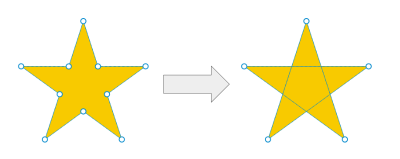
It may sound impossible to make a star out of only five points, but it’s perfectly possible, and the trick is how the points inside polygon() are ordered. If we were to draw a star with pencil on paper in a single continuous line, we would follow the following order:
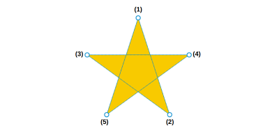
It’s the same way we used to draw stars as kids — and it fits perfectly in CSS with polygon()! This is another hidden trick about clip-path with polygon(), and it leads to another key lesson for drawing CSS shapes: the lines we establish can intersect. Again, we’re sort of turning a concept on its head, even if it’s a pattern we all grew up making by hand.
Here’s how those five points translate to CSS:
.star {
  width: 200px;
  aspect-ratio: 1;
  clip-path: polygon(50% 0, /* (1) */
    calc(50%*(1 + sin(.4turn))) calc(50%*(1 - cos(.4turn))), /* (2) */
    calc(50%*(1 - sin(.2turn))) calc(50%*(1 - cos(.2turn))), /* (3) */
    calc(50%*(1 + sin(.2turn))) calc(50%*(1 - cos(.2turn))), /* (4) */
    calc(50%*(1 - sin(.4turn))) calc(50%*(1 - cos(.4turn)))  /* (5) */
   );
}
See the Pen [Star shape using clip-path](https://codepen.io/t_afif/pen/NWmvBeL) by Temani Afif.
I am using trigonometric functions again for accuracy without resorting to magic numbers, but even if we calculate the values, the code is still better than the traditional 10-point approach:
.star {
  width: 200px;
  aspect-ratio: 1;
  clip-path: polygon(50% 0, 79% 90%, 2% 35%, 98% 35%, 21% 90%);
}
Since we have a symmetrical shape, note that the second and fifth points on the star share the same Y coordinates. The same is true for the third and fourth points. And notice, too, that the X values have the same distance to the center (79% - 50% = 50% - 21%). If we add those up, we see that the sum is equal to 100% (79% + 21% = 100%).
That leads us to yet another major lesson on drawing CSS shapes: Consider the shape’s symmetry because that’s a big hint that there may be duplicated values. This will reduce your effort in calculating/finding the different values.
We already cut the number of points once from 10 to five. Now, there are only three points to remember — the remaining two can be figured out from there, thanks to symmetry.
50% 0   /* (1) */
79% 90% /* (2)  --> (100% - 79%) = 21% 90% /* (5) */
 2% 35% /* (3)  --> (100% -  2%) = 98% 35% /* (4) */
Go back to the hexagon and octagon shapes and look for symmetry. You will notice repeated values as well, and the clip-path will suddenly look easier to remember!
Polygons & Starbursts
We’ve already covered stars, hexagons, and octagons, but what if you are working with an unknown number of points or sides? You may want a solution that is capable of adjusting the number for whatever situation it is used for. For this, we can consider more generic shapes like polygons and starbursts.
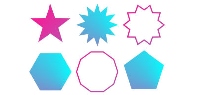
The funny thing is that starbursts are basically the exact same thing as polygons, just with half the points that we can move inward.
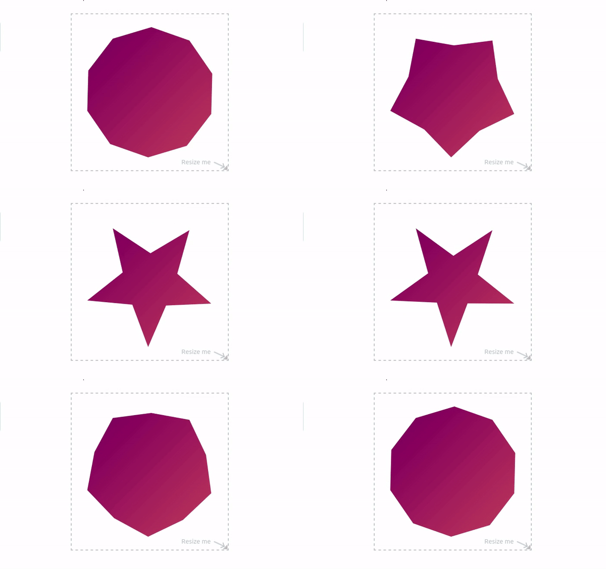
I often advise people to use my online generators for shapes like these because the clip-path coordinates can get tricky to write and calculate by hand.
That said, I really believe it’s still a very good idea to understand how the coordinates are calculated and how they affect the overall shape. I have an entire article on the topic for you to learn the nuances of calculating coordinates.
Parallelograms & Trapezoids
Another common shape we always build is a rectangle shape where we have one or two slanted sides. They have a lot of names depending on the final result (e.g., parallelogram, trapezoid, skewed rectangle, and so on), but all of them are built using the same CSS technique.

First, we start by creating a basic rectangle by linking the four corner points together:
clip-path: polygon(0 0, 100% 0, 100% 100%, 0 100%)
This code produces nothing because our element is already a rectangle. Also, note that 0 and 100% are the only values we’re using.
Next, offset some values to get the shape you want. Let’s say our offset needs to be equal to 10px. If the value is 0, we update it with 10px, and if it’s 100% we update it with calc(100% - 10px). As simple as that!
But which value do I need to update and when?
Try and see! Open your browser’s developer tools and update the values in real-time to see how the shape changes, and you will understand what points you need to update. I would lie if I told you that I write all the shapes from memory without making any mistakes. In most cases, I start with the basic rectangle, and I add or update points until I get the shape I want. Try this as a small homework exercise and create the shapes in Figure 11 by yourself. You can still find all the correct code in my online collection for reference.
If you want more CSS tricks around the clip-path property, check my article “CSS Tricks To Master The clip-path Property” which is a good follow-up to this section.
Masking Shapes In CSS
We just worked with a number of shapes that required us to figure out a number of points and clip-path by plotting their coordinates in a polygon(). In this section, we will cover circular and curvy shapes while introducing the other property you will use the most when creating CSS shapes: the mask property.
Like the previous section, we will create some shapes while highlighting the main tricks you need to know. Don’t forget that the goal is not to learn how to create specific shapes but to learn the tricks that allow you to create any kind of shape.
Circles & Holes
When talking about the mask property, gradients are certain to come up. We can, for example, “cut” (but really “mask”) a circular hole out of an element with a radial-gradient:
mask: radial-gradient(50px, #0000 98%, #000);
Why aren’t we using a simple background instead? The mask property allows us more flexibility, like using any color we want and applying the effect on a variety of other elements, such as <img>. If the color and flexible utility aren’t a big deal, then you can certainly reach for the background property instead of cutting a hole.
Here’s the mask working on both a <div> and <img>:
See the Pen [Hole shape](https://codepen.io/t_afif/pen/OJGgGve) by Temani Afif.
It’s here that I’d like to call out yet another lesson for creating shapes in CSS: The colors we use in gradients are completely unimportant when working with mask.
All we care about is the color value’s alpha channel because transparency is what is mask-ed out of the element, establishing the circular hole in the center. The gradient’s opaque colors preserve the visibility of the rest of the element. That’s why you will often see me using a black color value (e.g., #000) for the visible part and a transparent color (e.g., #0000) for the invisible part.
Notice the hard color stops in the gradient. A smooth transition between colors would lead to blurry lines. If we remove that transition and sharply change from one color to another, we get smooth, sharp edges. But not totally! I prefer to keep a very small transition (98% instead of 100%) to avoid jagged edges.
And with a simple radial-gradient, we can achieve a lot of shapes, like cutting a circle from the top or bottom of an element.
See the Pen [Circular cut from the top & bottom](https://codepen.io/t_afif/pen/MWRvBOL) by Temani Afif.
Let’s change it up and make the cut from the top and the bottom edges at the same time:
See the Pen [Circular Cut at top and bottom](https://codepen.io/t_afif/pen/WNWEKdy) by Temani Afif.
If we give the gradient an explicit size, then it will repeat, resulting in yet another fancy shape, a scooped border:
See the Pen [Scooped edges from top and bottom](https://codepen.io/t_afif/pen/eYoEjVa) by Temani Afif.
Rather than dissecting the code for that last example, I want you to peek at the CSS and see for yourself how the radial-gradient is configured. You will notice that we went from a simple hole to a fancy border decoration by making only a few changes.
Border Edges
The previous demo is one example of many fancy borders we can create. We can go wavy, spiked, scalloped, and more!

Once again, it’s all about CSS masks and gradients. In the following articles, I provide you with examples and recipes for many different possibilities:
- “Fancy CSS Borders Using Masks” (CSS-Tricks)
- “How to Create Wavy Shapes & Patterns in CSS” (CSS-Tricks)
Be sure to make it to the end of the second article to see how this technique can be used as decorative background patterns.
See the Pen [CSS only pattern](https://codepen.io/t_afif/pen/vYddpzK) by Temani Afif.
Rounded Arcs
This is another instance where CSS gradients are the perfect fit for mask-ing shapes. You’ve probably seen this type of shape a gazillion times because it’s a common pattern for animated loading indications.

This time, we are going to introduce another technique which is “composition”. It’s an operation we perform between two gradient layers. We either use mask-composite to define it, or we declare the values on the mask property.
The figure below illustrates the gradient configuration and the composition between each layer.
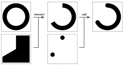
We start with a radial-gradient to create a full circle shape. Then we use a conic-gradient to create the shape below it. Between the two gradients, we perform an “intersect” composition to get the unclosed circle. Then we tack on two more radial gradients to the mask to get those nice rounded endpoints on the unclosed circle. This time we consider the default composition, “add”.
Gradients aren’t something new as we use them a lot with the background property but “composition” is the new concept I want you to keep in mind. It’s a very handy one that unlocks a lot of possibilities.
Ready for the CSS?
.arc {
  --b: 40px; /* border thickness */
  --a: 240deg; /* progression */

--_g:/var(--b) var(--b) radial-gradient(50% 50%,#000 98%,#0000) no-repeat;
mask:
top var(--_g),
calc(50% + 50% * sin(var(--a)))
calc(50% - 50% * cos(var(--a))) var(--_g),
conic-gradient(#000 var(--a), #0000 0) intersect,
radial-gradient(50% 50%, #0000 calc(100% - var(--b)), #000 0 98%, #0000)
}
See the Pen [Progress circle using mask](https://codepen.io/t_afif/pen/eYoEpom) by Temani Afif.
Even if the code looks a bit complex at first glance, the use of CSS variables makes things easier to adjust. That’s an important CSS technique I am using in most of the shapes I have created. Many of them require complex formulas and a lot of gradients, but in the end, all you have to do is adjust a few variables to control the shape. So, let’s not spend too much time explaining the math expressions. I want to focus on the tricks and techniques because the CSS concepts are what is important; remember, you can always grab the math. How CSS uses it is key.
Notice that we can achieve the same result using different gradient combinations. It’s weird because the syntax looks completely different. This snippet accomplishes the same visual result.
.arc {
  --b: 40px; /* border thickness */
  --a: 250deg; /* progression */

padding: var(--b);
border-radius: 50%;

--_g: /var(--b) var(--b) radial-gradient(50% 50%, #000 97%, #0000 99%) no-repeat;
mask:
top var(--_g),
calc(50% + 50% * sin(var(--a)))
calc(50% - 50% * cos(var(--a))) var(--_g),
linear-gradient(#0000 0 0) content-box intersect,
conic-gradient(#000 var(--a), #0000 0);
}
I added border-radius in there to round the element and added padding equal to the border’s thickness. Then, if you check the gradient used in the mask, you will see that I have changed the radial-gradient with a linear-gradient containing a single transparent color that covers the element’s content-box.
Sure, there are two more variables using this approach, but I did simplify the overall gradient at the same time. Yet another valid approach for the same effect.
See the Pen [Untitled](https://codepen.io/t_afif/pen/WNWErpV) by Temani Afif.
Dashed Circles
We can produce additional circular shapes with dashed edges using the same code we just wrote:
See the Pen [Dashed border](https://codepen.io/t_afif/pen/KKvjjZN) by Temani Afif.
This time we’re combining two gradients in our mask. One is a black-to-transparent repeating-conic-gradient and the other is a transparent linear-gradient configured to cover the element up to its content-box and the mask-composite property is set to intersect.
mask:
 linear-gradient(#0000 0 0) content-box intersect,
 repeating-conic-gradient( /* ... */ );
If you want to dig deeper into mask-composite, I advise you to read “Mask Compositing: The Crash Course” by Ana Tudor.
Rounded Tabs
Tabs are a super common design pattern. Each tab is connected to a panel of content where clicking a tab reveals that panel of content. Tabs can be rectangular, but we often think of them as rounded, the way they are on actual paper file folders.
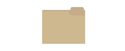
We could get clever and use a pseudo-element for the shape that’s positioned behind the set of panels, but that introduces more complexity and fixed values than we ought to have. Instead, we can continue using CSS masks to get the perfect shape with a minimal amount of reusable code.

It’s not really the rounded top edges that are difficult to pull off, but the bottom portion that curves inwards instead of rounding in like the top. And even then, we already know the secret sauce: using CSS masks by combining gradients that reveal just the parts we want.
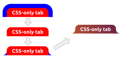
We start by adding a border around the element — excluding the bottom edge — and applying a border-radius on the top-left and top-right corners.
.tab {
  --r: 40px; /* radius size */

border: var(--r) solid #0000; /* transparent black */
border-bottom: 0;
border-radius: calc(2 * var(--r)) calc(2 * var(--r)) 0 0;
}
Next, we add the first mask layer. We only want to show the padding area (i.e., the red area highlighted in Figure 10).
mask: linear-gradient(#000 0 0) padding-box;
Let’s add two more gradients, both radial, to show those bottom curves.
mask:
  radial-gradient(100% 100% at 0 0, #0000 98%, #000) 0 100% / var(--r) var(--r),
  radial-gradient(100% 100% at 100% 0, #0000 98%, #000) 100% 100% / var(--r) var(--r),
  linear-gradient(#000 0 0) padding-box;
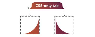
Here is how the full code comes together:
.tab {
  --r: 40px; /* control the radius */

border: var(--r) solid #0000;
border-bottom: 0;
border-radius: calc(2 * var(--r)) calc(2 * var(--r)) 0 0;
mask:
radial-gradient(100% 100% at 0 0, #0000 98%, #000) 0 100% / var(--r) var(--r),
radial-gradient(100% 100% at 100% 0, #0000 98%, #000) 100% 100% / var(--r) var(--r),
linear-gradient(#000 0 0) padding-box;
mask-repeat: no-repeat;
background: linear-gradient(60deg, #BD5532, #601848) border-box;
}
As usual, all it takes is one variable to control the shape. Let’s zero-in on the border-radius declaration for a moment:
border-radius: calc(2 * var(--r)) calc(2 * var(--r)) 0 0;
Notice that the shape’s rounded top edges are equal to two times the radius (--r) value. If you’re wondering why we need a calculation here at all, it’s because we have a transparent border hanging out there, and we need to double the radius to account for it. The radius of the blue areas highlighted in Figure 13 is equal to 2 * R while the red area highlighted in the same figure is equal to 2 * R - R, or simply R.
We can actually optimize the code so that we only need two gradients — one linear and one radial — instead of three. I’ll drop that into the following demo for you to pick apart. Can you figure out how we were able to eliminate one of the gradients?
I’ll throw in two additional variations for you to investigate:
See the Pen [Rounded tab using CSS mask](https://codepen.io/t_afif/pen/JjVpPmr) by Temani Afif.
I’m often asked how I know when my code can be optimized more than it is. That’s truly the most difficult part of everything we’ve covered so far. I do not have any hard rules for how and when to optimize, and it’s not necessary to find the optimal solution, especially if you are a beginner. My advice is to first find the trivial and easy solution, even if it requires a lot of gradients. Then, with a lot of practice, you will be able to find better solutions.
Talking about practice, here’s your next bit of homework: try creating the shapes illustrated in Figure 15:
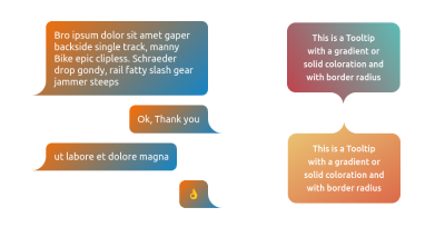
These aren’t tabs at all but tooltips! We can absolutely use the exact same masking technique we used to create the tabs for these shapes. Notice how the curves that go inward are consistent in each shape, no matter if they are positioned on the left, right, or both.
You can always find the code over at my online collection if you want to reference it.
More CSS Shapes
At this point, we’ve seen the main tricks to create CSS shapes. You will rely on mask and gradients if you have curves and rounded parts or clip-path when there are no curves. It sounds simple but there’s still more to learn, so I am going to provide a few more common shapes for you to explore.
Instead of going into a detailed explanation of the shapes in this section, I’m going to give you the recipes for how to make them and all of the ingredients you need to make it happen. In fact, I have written other articles that are directly related to everything we are about to cover and will link them up so that you have guides you can reference in your work.
Triangles
A triangle is likely the first shape that you will ever need. They’re used in lots of places, from play buttons for videos, to decorative icons in links, to active state indicators, to open/close toggles in accordions, to… the list goes on.

Creating a triangle shape is as simple as using a 3-point polygon in addition to defining the size:
.triangle {
  width: 200px;
  aspect-ratio: 1;
  clip-path: polygon(50% 0, 100% 100%, 0 100%);
}
But we can get even further by adding more points to have border-only variations:
See the Pen [border-only triangle shapes](https://codepen.io/t_afif/pen/XWGzJpP) by Temani Afif.
Or combine clip-path and mask to get rounded corner variations:
See the Pen [Rounded triangles (the modern way)](https://codepen.io/t_afif/pen/QWovwoW) by Temani Afif.
Please check out my article “CSS Shapes: The Triangle” on the Verpex blog for a full explanation of techniques with many examples and variations.
Hearts
Hearts are another classic shape that’s been tackled with older CSS techniques but have a better modern equivalent. We can pull this off more simply by combining border-image and clip-path:
.heart {
  --c: red;

width: 200px;
aspect-ratio: 1;
border-image: radial-gradient(var(--c) 69%,#0000 70%) 84.5%/50%;
clip-path: polygon(-42% 0,50% 91%, 142% 0);
}
See the Pen [Heart shape using border-image](https://codepen.io/t_afif/pen/MWPOJpP) by Temani Afif.
Or use mask-border instead of border-image to transform images into hearts:
See the Pen [CSS only heart images](https://codepen.io/t_afif/pen/PoRwjPM) by Temani Afif.
The full explanation with additional examples is available in my article “CSS Shapes: The Heart” over at the Verpex blog.
Ribbons
Ribbons were all the rage back when skeuomorphism was the design fad du jour. They’re still awesome today, and I’ve created a big ol’ collection of them with more than 100 shapes.
There are many different types of ribbons, as you might imagine. So, rather than detail one I will provide you with four articles I have written detailing the general technique (more clips!) and a variety of fun variations for you to consider.
- “CSS Responsive Multi-Line Ribbon Shapes, Part 1” (Smashing Magazine)
- “CSS Responsive Multi-Line Ribbon Shapes, Part 2” (Smashing Magazine)
- “CSS Shapes: The Ribbon” (Verpex Blog)
- “How to Create CSS Ribbon Shapes with a Single Element” (SitePoint)
Tooltips & Speech Bubbles
Like ribbons, there are so many ways we can design a tooltip or a speech bubble; so many that I have another collection showcasing more than 100 of them. The following two-part series provides all of the nitty-gritty details:
- “Modern CSS Tooltips And Speech Bubbles, Part 1” (Smashing Magazine)
- “Modern CSS Tooltips And Speech Bubbles, Part 2” (Smashing Magazine)
By the end, you can literally create as many variations as you can imagine.
Cutting Corners
Insert your obligatory joke about how we’re supposed to cut corners in life. However, when we cut corners out of squares and rectangles, the result is a nice decorative shape that also works as a frame for images.

We can cut all the corners or just specific ones. We can make circular cuts or sharp ones. We can even create an outline of the overall shape. Take a look at my online generator to play with the code, and check out my full article on the topic where I am detailing all the different cases.
Cut-Out Shapes
In addition to cutting corners, we can also cut a shape out of a rectangle. They are also called inverted shapes.
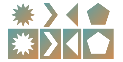
The technique is all about setting the CSS clip-path property with the shape’s coordinates in the polygon() function. So, technically, this is something you already know, thanks to the examples we’ve looked at throughout this guide.
See the Pen ["Cut-out shapes using clip-path"](https://codepen.io/t_afif/pen/gOJvdav) by Temani Afif ([@t_afif](https://codepen.io/t_afif))
My article titled “How To Create Cut-Out Shapes using The clip-path property” provides the details in full.
Section Dividers
Speaking of visual transitions between sections, what if both sections have decorative borders that fit together like a puzzle?

I hope you see the pattern now: sometimes, we’re clipping an element or masking portions of it. The fact that we can sort of “carve” into things this way using polygon() coordinates and gradients opens up so many possibilities that would have required clever workarounds and super-specific code in years past.
See my article “How to Create a Section Divider Using CSS” on the freeCodeCamp blog for a deep dive into the concepts, which we’ve also covered here quite extensively already in earlier sections.
Inner Curves
Inverted radius, notch, rounded cut, bell curve… many names can be used to describe these shapes with smooth inner curves. They’re also another use case of using CSS mask to combine gradients for creating variations.

See my article “How to create Shapes with Inner Curves using CSS Mask” on the Verpex blog to get more details. I’ll drop in two demos showing the different shapes in play:
See the Pen ["Inverted border-radius using CSS mask"](https://codepen.io/t_afif/pen/XWLJrWE) by Temani Afif ([@t_afif](https://codepen.io/t_afif))
See the Pen ["Fancy avatar header with hover effect"](https://codepen.io/t_afif/pen/oNrMJXL) by Temani Afif ([@t_afif](https://codepen.io/t_afif))
Floral Shapes
We’ve created circles. We’ve made wave shapes. Let’s combine those two ideas together to create floral shapes.

These shapes are pretty cool on their own. But like a few of the other shapes we’ve covered, this one works extremely well with images. If you need something fancier than the typical box, then masking the edges can come off like a custom-framed photo.
Here is a demo where I am using such shapes to create a fancy hover effect:
See the Pen [Fancy Pop Out hover effect!](https://codepen.io/t_afif/pen/qBQzrwq) by Temani Afif.
There’s a lot of math involved with this, specifically trigonometric functions. I have a two-part series that gets into the weeds if you’re interested in that side of things:
- “Creating Flower Shapes using CSS Mask & Trigonometric Functions” (Frontend Masters)
- “Creating Wavy Circles with Fancy Animations in CSS” (Frontend Masters)
As always, remember that my online collection is your Number One resource for all things related to CSS shapes. The math has already been worked out for your convenience, but you also have the references you need to understand how it works under the hood.
Wavy & Zig-Zag boxes
We saw how to create a Zig-Zag and a Wave on one side but we can also have them on all the sides and make fancy boxes!

Cool right? Check the following articles if you want to understand the logic behind creating them:
- “How to Create a Zig-Zag Box Using CSS” (Verpex Blog)
- “How to Create Wavy Boxes Using CSS” (Verpex Blog)
And here are a few demos where I am decorating images:
See the Pen ["Images inside wiggly boxes"](https://codepen.io/t_afif/pen/gbYBPma) by Temani Afif ([@t_afif](https://codepen.io/t_afif))
See the Pen Images inside wavy boxes by Temani Afif (@t_afif) on CodePen.
See the Pen CSS-only Zig-Zag box by Temani Afif (@t_afif) on CodePen.
Conclusion
I hope you see CSS Shapes differently now as a result of reading this comprehensive guide. We covered a few shapes, but really, it’s hundreds upon hundreds of shapes because you see how flexible they are to configure into a slew of variations.
At the end of the day, all of the shapes use some combination of different CSS concepts such as clipping, masking, composition, gradients, CSS variables, and so on. Not to mention a few hidden tricks like the one related to the polygon() function:
- It accepts points outside the
[0% 100%]range. - Switching axes is a solid approach for creating shape variations.
- The lines we establish can intersect.
It’s not that many things, right? We looked at each of these in great detail and then whipped through the shapes to demonstrate how the concepts come together. It’s not so much about memorizing snippets than it is thoroughly understanding how CSS works and leveraging its features to produce any number of things, like shapes.
Don’t forget to bookmark my CSS Shape website and use it as a reference as well as a quick stop to get a specific shape you need for a project. I avoid re-inventing the wheel in my work, and the online collection is your wheel for snagging shapes made with pure CSS.
Please also use it as inspiration for your own shape-shifting experiments. And post a comment if you think of a shape that would be a nice addition to the collection.
References
- “CSS Shapes: Polygon & Starburst” (Verpex Blog)
- “CSS Tricks To Master The
clip-pathProperty” (Verpex Blog) - “Fancy CSS Borders Using Masks” (CSS-Tricks)
- “How to Create Wavy Shapes & Patterns in CSS” (CSS-Tricks)
- “CSS Shapes: The Triangle” (Verpex Blog)
- “CSS Shapes: The Heart” (Verpex Blog)
- “CSS Responsive Multi-Line Ribbon Shapes, Part 1” (Smashing Magazine)
- “CSS Responsive Multi-Line Ribbon Shapes, Part 2” (Smashing Magazine)
- “CSS Shapes: The Ribbon” (Verpex Blog)
- “How to Create CSS Ribbon Shapes with a Single Element” (SitePoint)
- “Modern CSS Tooltips And Speech Bubbles, Part 1” (Smashing Magazine)
- “Modern CSS Tooltips And Speech Bubbles, Part 2” (Smashing Magazine)
- “Tricks to Cut Corners Using CSS Mask and Clip-Path Properties”
- “How to Create a Section Divider Using CSS” (freeCodeCamp Blog)
- “Re-Creating The Pop-Out Hover Effect With Modern CSS (Part 1)” (Smashing Magazine)
- “Creating Flower Shapes using CSS Mask & Trigonometric Functions” (Frontend Masters)
- “Creating Wavy Circles with Fancy Animations in CSS” (Frontend Masters)
- “Mask Compositing: The Crash Course” by Ana Tudor (CSS-Tricks)


 Celebrating 10 million developers
 Try ProtoPie AI free →
 SurveyJS: White-Label Survey Solution for Your JS App
 Register Free Now


