Learning is a process which continues throughout the life of an artist, graphic designer, and illustrator. Along the way, designers find the task of mastering Adobe Illustrator a large obstacle which requires practice and experience in using the vector-based application. Practice comes in the form of tutorials, which offer tips, tricks, and artistic styles from other designers who have mastered certain techniques based on their experience.
Read more…
CSS Font stacks are one of those things that elude a lot of designers. Many stick to the basic stacks tools auto-recommend or go even more basic by just specifying a single web-safe font. But doing either of those things means you’re missing out on some great typography options. Font stacks can make it possible to show at least some of your visitors your site’s typography exactly the way you intend without showing everyone else a default font.
Read more…
Though many computer applications and operating systems make use of real-world metaphors like the desktop, most software interface design has little to do with how we actually experience the real world. In lots of cases, there are great reasons not to directly mimic reality. Not doing so allows us to create interfaces that enable people to be more productive, communicate in new ways, or manage an increasing amount of information. In other words, to do things we can’t otherwise do in real life.
Read more…
Portfolio websites are critical for designers who want to get exposure for their work and attract new clients. While all portfolio sites will showcase the work of the designer, some have chosen to provide additional information about the project through case studies.
Read more…
Photoshop and Illustrator, as we’ve all come to realize, have revolutionized contemporary design and illustration, unleashing the creative potential of artists the world over. Through this tutorial, we’ll take you through process and technique, from sketch to Photoshop to Illustrator, so that you can learn skills to complement your ample creativity! [Updated May/02/2017]
Read more…
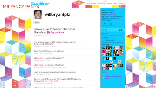
Smashing Magazine has been on Twitter for about a year now (@smashingmag), and it turned out to be a great medium to communicate with our audience, build connections, discuss design-related topics and give away some nice prizes. However, even a year later, we still don’t have a Twitter background page and now is a good time to change that. So because we decided to create our own Twitter page, we wanted to first find out how other designers do it and what tips and techniques they use to create a truly outstanding, beautiful Twitter page.
Your profile page is the only place on Twitter where you get opportunity to showcase your visual brand and possibly communicate additional information that can last longer than a tweet. You can customize your profile page by changing background, text and link colors. It’s as simple as changing the skin, but ability to change background image has allowed designers to create really unique profile pages.
Primary focus of this article is to explore various techniques to create unique, memorable and effective Twitter profile pages. However, before proceeding to the list, it is important to briefly discuss the structure of the Twitter profile page.
Read more…
In our recent study on Typographic Design Patterns and Best Practices, we asked our readers about case studies they would like us to conduct. One of the most popular suggestions was a detailed case study of portfolio websites.
Read more…
Time management is one of the most important skills a freelance worker can learn. With a good time management system you can easily find the time to do the things that are important to you, whether in your professional or personal life.
Read more…
The most important aspect of designing an individual icon is that it has to be instantly recognizable, you have to know its function, and you need to know exactly what it is.
Read more…
Stacking contexts in CSS are a complex topic. This article aims to explain everything you need to know about z-index so that you can use this special type of property confidently and effectively.
Read more…