Deciding what to do once you’ve purchased a domain but haven’t yet launched the website is always a bit of a conundrum. Leaving up your domain registrar or Web host’s generic page seems unprofessional, especially if you’re trying to drum up advance press for your new project. At the same time, you don’t want to spend too much time on a temporary page when you really should be working on the website itself.
Read more…
I recently ran into a site called Prom Night Fist Fight,which is the illustration, color, & typography experimentation playground of Joshua Blankenship. I was amazed at the awesome typography that I saw. For the next 30 minutes, I browsed his site, 1 awesome typography work after the other. If you need some typography inspiration, then you definitely need to check his site. He has over 200 pieces of awesomeness in his website. Not only does he have a lot, but each of them has its own unique style.
Read more…
Once in a while, I’ll be browsing the internet and would run into an artist that would just make me say, “WOW!” Well, Anthony Hare is one of them. This man has mastered the art of black and white illustrations. You absolutely need to see his work. I like his work very much. It is very clean, and the lines are sharp and crisp. Another thing that amazes me is not only the quality of his work, but the quantity of it as well. Anthony has tons of pieces in his portfolio and they are all really nice. You need to check out his portfolio site here.
Anyways, enough of me talking and more of you viewing. Go ahead and check out 20 of his illustrations that I have included here.
Read more…
“There is no specific London style.” At least that’s what the ‘Super Contemporary’ show at London’s Design Museum proclaims. During an exploration of London’s art and design scene in September 2009, what did emerge was a city with a unique sense of its own personality and history, a fertile hub of international thinkers, and a community working towards a future that is designed to be interactive, environmentally responsible, and prosperous.
Read more…
Your invoice should be prim and proper, so that you can get paid by your clients efficiently. While invoicing is not a fun task, it’s a necessary one: by keeping clients informed of your expectations, you will get paid punctually and reinforce your professionalism. After going over some best practices for creating invoices, we’ll review some great (and not so great) online invoicing tools, so that you can spend less time creating invoices and more time doing the things you love!
Read more…
The most recent collection of creative blog designs was featured here on Smashing Magazine back in July. Only three months have passed and we’ve got a new dose of inspiration for you. Beautiful and sophisticated designs are constantly appearing on the Web; creative activity is in non-stop mode, despite global economic shocks and unfortunate events; and this is surely a positive sign.
Today, we showcase 60 fresh, beautiful, inventive and, hopefully, inspiring blog designs. The variety of styles represented in this collection is considerable, so everyone will be able to find a tasty piece of inspiration for their own creative aspirations. Notice that every screenshot is clickable and leads to the website itself.
Read more…
The other day, while browsing some logo galleries, I noticed the trend of using stars in logos. I saw all kinds of different companies and organizations who used a star in their logo. It used to be that the main companies who used a star were only entertainment companies or Hollywood companies, but now, I even saw pharmaceutical companies and medical companies using the star.
I think that this has quickly become a fast growing trend in the design community. Here is a compilation of 50 star logos that I gathered to show you this up and coming trend in logo design.
Read more…
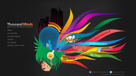
Textures have become more popular and been put to greater use in recent years. They’re not limited to Web design either; textures of all kinds are used in print design, illustration, traditional art, TV commercials… you name it! Texture is one of the best ways to add depth to your design, whether it’s subtle noise on a clean vector illustration or a lot of grunginess throughout a layout.
Over the last weeks we collected numerous examples of beautiful textured Web designs to inspire you, followed by a small collection of links to help you get started in using textures in your own designs.
Read more…
Inspiration is vital for any designer. This is why so many CSS galleries, design galleries and artistic showcases are floating around on the Web. Designers use these at certain times for a quick fix of inspiration, especially when the pressure of deadlines prevent them from seeking out offline, or “alternative,” forms of inspiration, as important as they are.
Read more…
Ireland. The land of the leprechauns, green fields and Guinness. But what about the web industry in Ireland? There have been a host of interesting things happening both North and South of Ireland recently. Nicholas Felton talked in Belfast, Ze Frank talked in Dublin, FOWA came to Dublin for the first time and FOWD came to Belfast. Are all these high profile events an indication that there are exciting things happening throughout Ireland?
Read more…