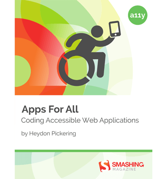
Apps For All: Coding Accessible Web Applications
Accessibility is not just about addressing specific disabilities, but making sure as many people as possible have access to the same information.
Written by Heydon Pickering and reviewed by Steve Faulkner.
About The Book
Accessibility is not just about addressing specific disabilities, but making sure as many people as possible have access to the same information. There’s rarely a good reason to lock people out when openness is a foundational principle of the web.
Web accessibility is quite a large topic — far too large to fit into a small book. So, what will this book cover? Though we shall encounter visual design challenges, deal with performance issues, and adopt progressive enhancement — all of which are accessibility concerns — the underlying theme of this book is about making the interactivity of web applications include keyboard and screen reader users.
Starting with defining simple button controls and moving on to create reusable, accessible widgets, this book is about making interactions possible and meaningful for those who suffer from cognitive and motor impairments, as well as users who experience a range of vision impairments. However, the lessons learned from addressing the specific requirements of those using assistive technologies or consuming information in unusual ways can be applied to enrich the web for everyone. We all win.
Excerpt From Chapter 2
It’s All About Buttons
“It’s easy to think of using proper semantic HTML as fussy and overparticular; that using the right element for the job is not really that important. Since you can attach JavaScript events to any old element and you can make any old element look like a button with CSS, isn’t which element you use a bit academic?
It can seem that way, but no. You see, web standards are all about agreement. It’s only through agreement that things can be made to work and behave in ways that are predictable for the greatest number of people. By designating certain behaviors to the <button> element, browser vendors can agree on how the element should be rendered and how it should behave.
This way, authors like you and I will know which element to code if we want to elicit these behaviors. We work with the browser vendors to make our users’ lives easier. By convention, they know what they’re getting when they encounter a button.”
Excerpt From Chapter 5
Peekaboo
“You won’t get far on the web these days without stumbling on some sort of tabbed interface. You know the kind of thing: a line of tabs, like those used in a filing cabinet, with each corresponding to their own pane or panel of content. It’s a popular pattern because it allows users to browse and switch between content, excluding from view anything they’re not interested in.
In fact, tabbed interfaces are so popular, it’s tempting to think of them as done: the JavaScript to show and hide panels is easy to write and easier to steal, which just leaves the visual design to be pondered. […]
Important questions I’m sure, but a good-looking tabbed interface does not a good tabbed interface make — not on its own. Is the underlying structure properly semantic and accessible? The JavaScript shows one panel and hides the others, but is this action really communicated to everyone? Can everyone perform that action in the first place?”
Testimonials
It has been our goal to make the book as practical and useful as possible. We’ve been honored to receive very positive reviews from people making websites on small and large scale.
“Heydon has written a truly awesome book here! He gets right to the stuff that developers love most: Coding. He provides concise context for those not too familiar with accessibility yet, but doesn’t scare devs with legal stuff. He concentrates on the positive impact aspects aside those legal reqs and thus makes sure the book is fun to read! The examples are not some abstract form of things one will never encounter anyway. On the contrary: They are examples you can integrate right into the web applications you develop and thereby make sure more potential customers than you can even think of at the moment will enjoy using your work! If you’ve been looking for a modern up-to-date easy introduction or refreshment to/of accessibility coding skills, this is the book to purchase!”— Marco Hengstenberg, Pixelpusher & Websitewrangler
“Having read this book over the last couple of days I am in no doubt as to what all the developers at work are getting for Xmas. Its a fantastic read that sets out the reasons for WAI ARIA in a really easy to read and understand manner. the concepts are well explained and the code snippets are an awesome compliment to the well delivered prose. Its both funny and educational at the same time and I would highly recommend it to any developer who is keen to broaden his skill set. Fantastic job Heydon and I look forward to the sequel :)”— Hamish Mackenzie, Global Accessibility Manager
“This book is a little gem. There are many useful and well coded examples that cover common accessible design patterns that many more conscious web developers will find downright essential in their day to day work.— Joshue O Connor, editor of the new WCAG 2.1 accessibility standardHeydon does a great job of helping the reader understand an inclusive design approach and the often rather granular ‘step by step’ process that accessible web applications need in order to be accessible.
I especially found the section on focus management (which is a complex subject) really useful, with nice short code snippets but that is certainly not the only area that surprised.
Heydon has a warm writing style and nicely walks the line between the need for supporting legacy user agents/AT and the cutting edge. Finally, he also helps to remind us of how exciting implementing accessible and inclusive design in our projects can be - with its many inherent challenges and rewards.”
About The Author
 Heydon Pickering is a writer, designer and public speaker, the accessibility editor for Smashing Magazine, and an accessibility consultant working with The Paciello Group. He's interested in new and innovative ways to make The Web an inclusive place. User research, systems thinking and plain old semantic HTML all play their part. When Heydon isn't writing, coding or illustrating, he experiments with sound design and thrashes out Doom Metal riffs of his detuned SG copy.
Table of Contents
- This Is For Everyone — Though we shall encounter visual design challenges, deal with performance issues, and adopt progressive enhancement — all of which are accessibility concerns — the underlying theme of this book is about making the interactivity of web applications include keyboard and screen reader users.
- It’s All About Buttons — For many years, the World Wide Web was defined almost entirely by a peculiar type of button called a hyperlink which, when pressed, would take a reader from one location to another in a continuum of in- terconnected documents. First alphabetically and first in importance, only the <a> element could be said to truly define the web: it’s the glue which holds all our shared knowledge together.
- The WAI Forward — Even when we branched out to do something a little more radical with CSS transitions, we made sure our technique was a progressive enhancement, built on robust foundations. This way, older browsers and other technologies still had something to fall back on.
- Getting Around — The structure of webpages which many people consume visually, set to a grid, is no structure at all to those who are not looking. To screen reader users, grids do not exist. The extra time it takes the page to load your perfect golden ratio grid system framework is all for nothing to them. Even keyboard users (who can at least adjust their gaze to a new item) are not really helped by a multiple column layout. They still have to cover the same distance, just sideways.
- Peekaboo — Looking at JavaScript-driven web interfaces, by far the most common interaction style is based on showing stuff or hiding it or... oh, that’s pretty much it. Strip away the idiosyncratic design, the transition type, scaling, and all the other nuances and — underneath — you’re left with one of:
- It’s Alive! — To ensure users get the message, ARIA provides live regions. As their name suggests, live regions are elements whose contents may change in the course of the application’s use. They are living things, so don’t always stand still. By adorning them with the appropriate ARIA attributes, these regions will interrupt the user to announce their changes as they happen.
- Welcome To The Community — To conclude this introduction to web application accessibility, I’d like to introduce you to the accessibility community and many of the fantastic free tools and resources available to help you build accessible applications.
Technical Details
- Formats: ePUB, Kindle, PDF (DRM-free)
- Pages: 121
- Language: English
- Released: June 2014
- Publisher: Smashing Media AG
- ISBN (PDF): 978-3-94454079-5
More Books
Accessible UX Research
Success At Scale
Interface Design Checklists
166 practical cards for common interface design challenges.
Understanding Privacy
How to put your users first and make a better web.
Touch Design for Mobile Interfaces
Want to learn how to improve the design of your mobile digital products? Learn how touchscreen devices really work — and how people really use them.
Image Optimization
Deliver high-quality responsive images in the best format and size, and at the moment your users need them.
TypeScript in 50 Lessons
Everything you need to know about TypeScript, its type system, and all its benefits in 50 lessons.
Click!
A guide to increasing conversion and driving sales sustainably.
The Ethical Design Handbook
A practical guide on ethical design for digital products.
Inclusive Components
Handbook for building robust, accessible interfaces.
Smashing Print
A printed magazine designed to make you think.
Art Direction for the Web
Creating engaging, art-directed experiences on the web.
Smashing Book 6
Exploring new frontiers in front-end and design.
Design Systems
Create effective design systems that empower teams to create great digital products.
Form Design Patterns
Designing and coding inclusive and usable web forms.
User Experience Revolution
Help organizations understand and embrace digital.
White Hat UX
How to avoid dark patterns and improve user experience.
Digital Adaptation
Helping traditional companies embrace and make use of digital.
Inclusive Design Patterns
Creating bulletproof, accessible HTML/CSS components.
Smashing Book #5
Smart responsive design techniques from real projects.
The Sketch Handbook
Everything you need to know to understand and use Sketch.


