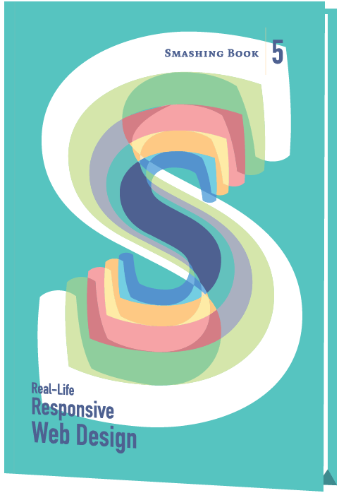
Smashing Book #5: Real-Life Responsive Web Design (eBook)
Responsive design is a default these days, but we are all still figuring out just the right process and techniques to better craft responsive websites. That’s why we created a new book — to gather practical techniques and strategies from people who have learned how to get things done right, in actual projects with actual real-world challenges.
About The Book
Responsive design is a default these days, but we are all still figuring out just the right process and techniques to better craft responsive websites. That’s why we created a new book — to gather practical techniques and strategies from people who have learned how to get things done right, in actual projects with actual real-world challenges.
The book features practical front-end techniques and patterns from well-respected designers and developers. It isn’t concerned with trends or short-lived workarounds — it should stand the test of time and as such, it’s focused on actual techniques used today in real-life projects. The techniques that you could apply to your websites today, too.
Smashing Book 5: Real-Life Responsive Web Design is jam-packed with smart front-end techniques and design patterns derived from real-life responsive projects. With 13 chapters on responsive workflow, SVG, Flexbox, Web fonts, responsive images, responsive email, content strategy, debugging, performance and offline experience, this is just the book you need to master all the tricky facets and hurdles of responsive design.
Table of Contents
- Preface — Front-end techniques. Scalability. Design systems. Bullet-proof solutions. Real-world challenges. —
- Responsive Designer's Workflow — Responsive workflow. Element collage. Style tiles. Tools. Deliverables. Performance budget. Interface inventory. Sketching. Planning. Manifestos. Hypothesis. Atomic design. Designing in the browser. Photoshop. —
- Responsive Design Patterns & Components — Design patterns. Navigation. Smart front-end techniques. Priority+ pattern. Improved off-canvas. Lazy loading. Autocomplete. Filters. Responsive PDF. Portrait/landscape mode. Sliders. Country selector. Responsive iconography. —
- Structured Content for RWD — Structured content. Content consistency. Content models. Structural audit. Editorial content. Content types. Content relationships. Data-driven gaps. Feature-driven gaps. Authors and editors. CMS. Content maintenance. —
- Mastering SVG For RWD And Beyond — SVG. Syntax. Accessibility. Viewport. ViewBox. Exporting. Embedding. Sprites. Icon systems. Data URIs. Performance. Smart SVG techniques. Responsive iconography. Cross-browser fallbacks. —
- Building Responsive Components With Flexbox — Syntax variants. Flex container. Orientation. Wrapping. Sizing boxes. Flex property. Forms with Flexbox. Advanced alignment. Magical margins. Reordering boxes. Order property. Flexbox as progressive enhancement. —
- Web Fonts Performance — Font formats. Font loading. Font-rendering. FOIT and FOUT. Font Loading API. Fallback fonts. Inlining fonts. Simulating swapping. Promises. Asynchronous loading and caching. Prioritized loading. —
- Using Responsive Images, Today — CSS pixel and DPR. Retina displays. Fixed-width images. Variable-width images. Srcset and sizes. Art direction. <picture> element. Separation of concerns. Image format fallback. Accessibility. Background images. Image optimization. WebP and JPEG-XR. Compressive images. Deployment. Common pitfalls. —
- The Dark Side Of Responsive HTML Email — Email landscape. CSS in email. Market share. Navigation and CTA buttons. Foundational markup. Reset and client-specific CSS. Fluid containers. Pattern-based development. Layout techniques. Microsoft Outlook. Windows Live Mail. Apple Mail. Mozilla Thunderbird. Outlook.com. Yahoo! Mail. AOL. iOS Mail. Gmail. —
- Testing, Maintaining And Debugging RWD — “Cutting the mustard”. Predictable, simple CSS. Naming conventions. BEM and class names. Sass organization. Debugging media queries. Lazy loading. Content-out media queries. Separation of concerns. Exploratory testing. Functional testing. Visual regression testing. Automated testing. Dealing with false positives. Common dependencies. Troubleshooting bugs on mobile. —
- Counting Stars: Creativity Over Predictability In RWD — Advertising. User experience design. Creative hijinks. Allergic to research. Process and predictability. Building blocks of creativity. Intoxicated by process. Platform for creativity. Creative brief. Line between control and chaos. Buying creativity. copywriting. Creative teams. Creative direction —
- Beyond Responsive: Optimizing For Offline — navigator.onLine. Online and offline events. HTML5 Application Cache. Cache manifest. Fallbacks. AppCache gotchas. Web Storage. localStorage. Service Workers. —
- Efficient Responsive Process With Clients — Collaboration. Estimates. Spiraling. “One-deliverable” workflow. Efficiency. Content priority guide. Style comparisons. Testing the aggregate. Content prototype. Wireframes. Style prototypes. Pattern libraries. Happy teams. —
- Performance Optimization Roadmap — Mobile first. jQuery dependence. Dealing with IE8. Advertising. Refactoring. Code inventory. Front-end optimization. Performance budget. SpeedIndex. Deferring web fonts. Critical CSS. Smart font fallback. Dealing with JavaScript. Asynchronous loading. SPDY/HTTP 2.0. Core content/functionality priority lists. Responsive images. —
Technical Details
- Formats: ePUB, Kindle, PDF (DRM-free)
- Pages: 584
- Language: English
- Released: June 2015
- Publisher: Smashing Media AG
- ISBN (PDF): 978-3-945749-21-0
More Books
Accessible UX Research
Success At Scale
Interface Design Checklists
166 practical cards for common interface design challenges.
Understanding Privacy
How to put your users first and make a better web.
Touch Design for Mobile Interfaces
Want to learn how to improve the design of your mobile digital products? Learn how touchscreen devices really work — and how people really use them.
Image Optimization
Deliver high-quality responsive images in the best format and size, and at the moment your users need them.
TypeScript in 50 Lessons
Everything you need to know about TypeScript, its type system, and all its benefits in 50 lessons.
Click!
A guide to increasing conversion and driving sales sustainably.
The Ethical Design Handbook
A practical guide on ethical design for digital products.
Inclusive Components
Handbook for building robust, accessible interfaces.
Smashing Print
A printed magazine designed to make you think.
Art Direction for the Web
Creating engaging, art-directed experiences on the web.
Smashing Book 6
Exploring new frontiers in front-end and design.
Design Systems
Create effective design systems that empower teams to create great digital products.
Form Design Patterns
Designing and coding inclusive and usable web forms.
User Experience Revolution
Help organizations understand and embrace digital.
White Hat UX
How to avoid dark patterns and improve user experience.
Digital Adaptation
Helping traditional companies embrace and make use of digital.
Inclusive Design Patterns
Creating bulletproof, accessible HTML/CSS components.
Smashing Book #5
Smart responsive design techniques from real projects.
The Sketch Handbook
Everything you need to know to understand and use Sketch.


