October 4, 2016 Smashing Newsletter: Issue #167
Editorial This newsletter issue was sent out to 198,353 newsletter subscribers on Tuesday, October 4th 2016. If you are not subscribed yet, feel free to subscribe to our email newsletter anytime. How do we avoid getting trapped in today’s Javascript frameworks madness? How do we make websites more resilient? How do we break out of the predictable, generic, boxy layout? And how in the world do we solve complex problems more efficiently?

Editorial
This newsletter issue was sent out to 198,353 newsletter subscribers on Tuesday, October 4th 2016. If you are not subscribed yet, feel free to subscribe to our email newsletter anytime.
How do we avoid getting trapped in today’s Javascript frameworks madness? How do we make websites more resilient? How do we break out of the predictable, generic, boxy layout? And how in the world do we solve complex problems more efficiently?

With SmashingConf Barcelona 2016 coming up on October 25–26th 2016, we’ve got Peter Sunde, Sara Soueidan, Jen Simmons, Stephen Hay, Jeremy Keith, Maciej Ceglowski and Jonathan Snook joining our fantastic speaker line-up, who’ll be answering those questions, and more! We’d love to see you in magnificent Barcelona, so go grab your ticket if you still haven’t!
Barca, here we come!
— The SmashingMag Team
1. E-Commerce Design Inspiration
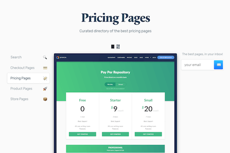
When Thomas Chrétien was working on a pricing page for a client, he looked at his favorite products for inspiration and how they communicate their pricing options. Fascinated by the matter, Thomas soon started to collect his findings; in a Sketch file at first, and as that grew larger, he decided to share his collection with fellow designers and developers. The result is Pricing Pages, a curated collection of, well, pricing pages.

If you’re working on an e-commerce project yourself, the directory is a rich source of fresh ideas. And in case you’re looking for even more e-commerce inspiration, the sister projects Checkout Pages, Product Pages, and Store Pages have you covered as well. (cm)
2. Mastering The Onboarding Challenge
Getting users to sign up for your product is quite easy. The real challenge is to get them to come back and turn them into happy customers. The team behind the customer community platform Intercom knows how hard this can be from their own experience. So to help you optimize your product’s onboarding process, they boiled their most valuable lessons learned from onboarding tens of thousands new users down into one, free eBook: Intercom on Onboarding.

The eBook consists of nine chapters jam-packed with strategies and advice to master the crucial first impression. You’ll learn to activate new signups, customize their ensuing journey, and, thus, lay the foundation for a long-lasting product-customer-relationship. The eBook is free to download, however, in order to do so, you’ll need to enter your email address and share the book with a friend, or you can donate $5 to charity instead. A good read. (cm)
3. A Collaborative Interface Design Tool
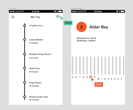
When you’re working on an interface design together with your team, it can be a pain to keep track of the most up-to-date assets. To spare you the drill of constantly syncing and versioning changes, you might want to give Figma a try. The interface design tool is not only intuitive to use but also comes with a handy multiplayer editing feature, so you and your team can work together on the same file, in real time. A built-in commenting feature even lets you communicate on the design.

Collaboration is one aspect where Figma shines, another strength lies in crafting responsive layouts: Designs automatically adapt to different screen sizes and a feature called “Live Design Preview” mirrors your changes to your mobile devices in real time. If you want to give it a try, Figma is free to use through the end of 2016. It doesn’t require any installation and works on any operating system. A powerful tool. (cm)
4. A Color Palette Built With Accessibility In Mind
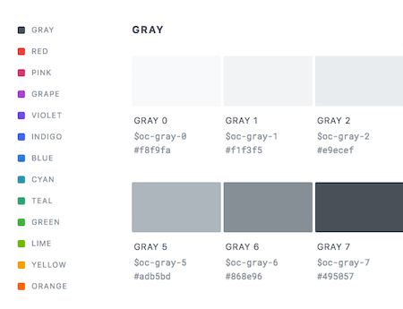
Choosing the right colors for a project is a challenging task, especially with accessibility in mind. That’s where Open Color comes in. The project attempts to simplify your color decisions by providing a color scheme for UI design that is tested in deuteranopia and protanopia (variations of red-green color blindness) mode. The scheme contains gray plus twelve colors with ten tints and shades each that you can use for fonts, backgrounds, borders, etc.

To use the palette, just import the given CSS, SCSS, or LESS file to your project, and you don’t need to fumble with hex values or the like anymore. All you need to make use of a color are the Open Color variables. For designers, the scheme is also available as an Adobe library, Photoshop/Illustrator swatches, and a Sketch palette. Convenient! (cm)
5. Tab Panels, The Right Way
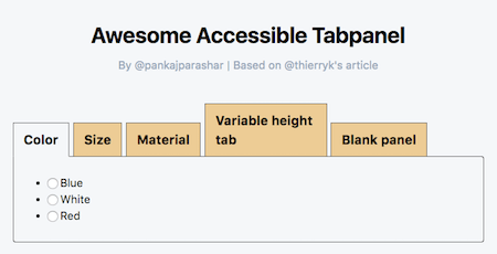
Tab panels are a double-edged sword. They might be useful to save screen real estate, however, from an accessibility point of view, they are a real bottleneck. Thierry Koblentz now published an extensive article about the issues that come with them (and their companion jump links in particular) and how we could do better.

The heart of the article is an 11-step guide that helps improve tab panels and, thus, cater for a better user experience. The base is a simple set of heading / div pairs — plain old semantic markup free of any jump links — to which you add ARIA attributes. The best approach, argues Thierry, would be to rely on arrow keys to cycle through the tab items while at the same time allowing users to tab through the items and select a tab to move focus to its associated panel. An interesting concept. To see it in action, check out the demo by Pankaj Parashar. (cm)
6. Strong Examples Of Art Direction
It’s always nice to see websites that have a strong focus on art direction. We stumbled across a few inspiring examples recently and, well, we don’t want you to miss out on them. The article “Devils, Deals and the DEA”, a co-publishing project of ProPublica and The Atlantic about Chapo Guzman and why he was the biggest winner in the DEA’s longest running drug cartel case, is one of them. A straightforward design without any frills, perfectly matching this piece of in-depth journalism.

Another example is the website of Epicurrence. The event for creatives describes itself as a “non-conference”, and well, this uniqueness is also reflected in the design. There is no strict separation between textual and image content, elements overlay each other, yet there is a lot of whitespace, a lot of room. Perfect for an event that will take place mostly outdoors, in a National Park.
Other conferences rely on strong art direction to promote their events, too. Circles Conference, for example, presented itself as bold and colorful this year. Geometrical patterns and unusual shapes inspired by the 80’s aesthetics are the characteristic elements of its design. Webstock’s 2016 website comes with an eyecatching, interactive opener graphic and a color changing background, the rest of the page is held rather subtle. Valio Con on the other hand, has an unusual approach to put its speakers into the center of attention — with subtly tinted speaker photos placed in colorful boxes that are arranged differently depending on your viewport. Not enough, yet? Then also be sure to check out the websites of Squares Conference, Forge Conference, and From the Front. Their little, art-directed finesses certainly don’t rank behind. Keep your eyes open! (cm)
Inspiration, Freebies, Misc.
That’s All, Folks!
Thank you so much for reading and for your support in helping us keep the web dev and design community strong with our newsletter. See you next time!
Smashing Newsletter
Useful front-end & UX bits, delivered once a week. Subscribe and get the Smart Interface Design Checklists PDF — in your inbox. 🎁
You can always unsubscribe with just one click.
Previous Issues
- UX Mapping and Service Blueprints
- Designing Voice UX
- New CSS Features and Techniques
- Designing For Complex UIs
- Hidden Gems of the Web
- Web Performance 2026
- Designing Surveys
- Accessibility and Inclusive Design
- Interface Design Patterns
- UX Research Strategies and Tools
Looking for older issues? Drop us an email and we’ll happily share them with you. Would be quite a hassle searching and clicking through them here anyway.

