
November 29, 2016 Smashing Newsletter: Issue #171
Editorial This newsletter issue was sent out to 235,317 newsletter subscribers on Tuesday, November 29th 2016. If you are not subscribed yet, feel free to subscribe to our email newsletter anytime. More often than not, we all seem to keep on complaining about generic, predictable websites, but how do we break out of the box? Well, we should try something new. Something that goes against general best practices. Something playful and original.

Editorial
This newsletter issue was sent out to 235,317 newsletter subscribers on Tuesday, November 29th 2016. If you are not subscribed yet, feel free to subscribe to our email newsletter anytime.
More often than not, we all seem to keep on complaining about generic, predictable websites, but how do we break out of the box? Well, we should try something new. Something that goes against general best practices. Something playful and original. Experimental and unconventional. What could it be?
How about everything! On an eCommerce site, it could be a responsive configurator with AR integration. On a trip-planning website, it could be a little feature such as exporting to Google Calendar or Microsoft Word (see Zürich Trams, for example). You could also integrate video and audio to tell a story in a more profound way. The easiest way to be unique is to use custom illustrations, animations and experimental layouts. You could even go as far as providing an anaglyph experience!
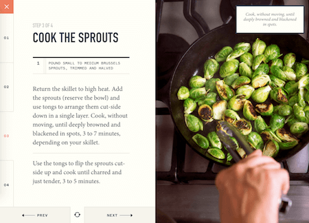
Instead of selecting a predictable grid, try to pick up something unpredictable, e.g. a random placement of elements, a random animation, or even a random style for your illustrations. Find your style and use it consistently, for everything. More often than not, you’ll come up with something unique because it will shine with your personality rather than use a generic visual language used countless times throughout the web.
And while doing so, you may be using tools like Sketch. If so, we’ve just released The Sketch Handbook (Print + eBook) with pretty much everything you need to know about Sketch to master your skills. No theory — just practical examples that you can follow along, step by step. That should help to get the ball rolling!
Keep playing and experimenting, — Vitaly (@smashingmag)
1. HTTP/2 And Ordering Pizza
Imagine you go to your neighborhood pizza place. You go in, order two slices of your favorite pizza and perhaps a soda, and you’re on your way in three minutes. The staff can handle your request easily because these kinds of orders are what their business model is made for. No big deal. However, when you decide to invite the little league baseball team to that pizza place, things get complicated. Everyone will order something different, things get disorganized quickly, and, thus, wait times go up. What does this have to do with web development? A lot, as Ben Tinsley shows.
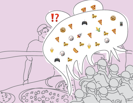
He uses the pizza example to illustrate the differences between HTTP/1.1 and HTTP/2. The little league invitation is a good metaphor to show where the strengths of HTTP/2 lie: When asset requests happen at the same time, HTTP/2 allows the server to go and find the assets without any delay because they all happen at once. “Multiplexing” is the magic term here — one of the major promises of HTTP/2 that makes it possible to improve speed and efficiency. To help you get started with HTTP/2, Ben also shares his lessons learned and best practices. Handy!
2. Everything You Need To Know About Designing Icons
Ever thought about creating your own icon set? Then you might want to check out the Free Icon Design Guide that Justas, the creative mind behind Icon Utopia, has put together. In the 56-pages-long, free eBook, he compiled valuable tips and tricks to give your icon design endeavour a head start.
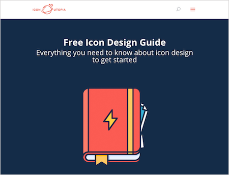
To start off, the eBook sheds some light on the origins of iconography and why icons matter today. From there on, you’ll explore icon design fundamentals and the technical details you need to know before you get started with your own icons. You’ll learn about different types of icons, about the variety of styles that are possible, and you’ll find out about the usage of grids. Finally, Justas will guide you through the actual design process — from deciding on a theme and style, to sketching out your ideas and choosing the right grid size and picking colors. Good stuff. To download the eBook, you need to enter your email address. It will then be delivered right to your inbox. (cm)
3. Improving Surveys With Triple Testing
Gathering data by sending a survey is easy. But not all data is good data and often you’ll inadvertently gather misleading and inaccurate data. Maybe because your questions aren’t clear, maybe because they don’t allow participants to give the answers they want to give. So before you hit “Send” next time, Leisa Reichelt recommends to triple test your survey.
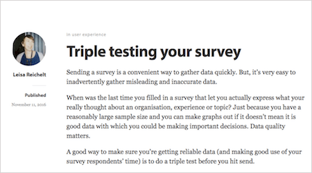
The process is easy: After having created the survey, go and find someone who matches the target audience the survey aims at. Ask them to complete the survey and watch them while they do it. This gives you the opportunity to see if they understand it and to ask questions. Then adjust the form based on your observations. Leisa advises to repeat these steps with at least three different people. This helps to iron out pitfalls and improve the survey experience and, in effect, the quality of the data you’re about to gather. Clever! (cm)
4. Keeping FOUT Shifts To A Minimum
Flash of unstyled text. If you’re using web fonts, you’re used to seeing that flickering between the initial render of your fallback font and the web font you’ve chosen. While this doesn’t look nice, there’s another issue that comes along with it: The layout might shift jarringly due to sizing discrepancies between the two fonts. To keep the unloved side effect to a minimum, Monica Dinculescu created Font Style Matcher.
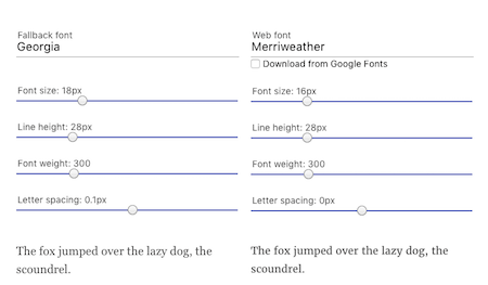
The idea behind the tool is simple, yet genius: It helps you minimize the discrepancy between fallback font and web font so that the layout shift isn’t as harsh. Just use the sliders to adjust font size, line height, font weight, and letter spacing, to find the settings that best match the x-height and width of your fallback font and the intended web font. One for the bookmarks. (cm)
5. Take Your Layouts To The Next Level With CSS Grid
Laying out web pages with CSS has always been hacky. In the early days, we used tables, then floats, positioning and inline-block. While these led to more or less satisfying results, not everything could be accomplished with these hacks. Just think of vertical centering. Flexbox finally provides a way to fill the existing gaps, but when it comes to complex layouts, even Flexbox has its limits. That’s where CSS Grid comes in. CSS Grid is the first CSS module that was created particularly for solving these common layout problems — for good.
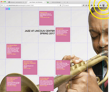
To help you take your layouts to the next level, Chris House wrote up a comprehensive guide on all things Grid. In it, he provides information on browser support, important terminology, and a glossary of Grid properties. The guide is based on the latest version of the specification and will be updated regularly.
A neat little helper to visualize the grid lines you’re building with in the browser is the Firefox add-on CSS Grid Inspector. But please be careful here: The tool is still experimental, so if you encounter any flaws, you can report the problem to the Mozilla Developer Relations team. Last but not least, make sure to also stop by Jen Simmons’ experimental layout lab where she shares her know-how about layouting and accomplishing real art direction on the web. (cm)
6. Bookmark-Worthy Resources For Front-End Devs
As a developer, you never stop learning, and that’s why it’s always a good thing to have some valuable resources at hand. Have you seen the collection of resources that Bruce Lawson and Shwetank Dixit put together for Progressive Web Apps, for example? They compiled articles and videos to help you enter the world of PWAs and learn things in depth.
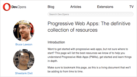
The list features resources for everything from making your app’s UI run smoothly and using push notifications to preparing it for offline use with service workers. Selected tools and libraries help you save precious time when building Progressive Web Apps, and showcases and case studies reveal a peek at what others are doing. Bookmark-worthy, especially, since new resources are being added from time to time.
Another one for the bookmarks is Stuart Robson’s collection of resources that’ll teach you to sprinkle a bit of BEM into your development process. And if you’re looking for something more diverse, Andrew Romanov’s repository of YouTube channels for front-end developers might be for you. Refreshing to see that her collection isn’t limited to videos in English only, but also offers a good variety of Russian channels, and a few French, Portuguese and Czech ones are featured, too. (cm)
7. An Advent Calendar For UX Folks
December is just around the corner, and what better way to start the celebrations than with an advent calendar to count down the days to Christmas? A special goodie to sweeten the waiting comes from the folks at Thirst Studios and UX Mastery: UXmas.
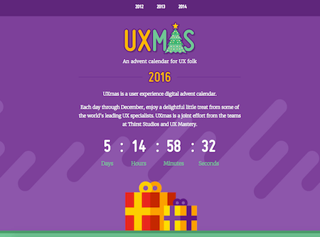
In tradition of the advent calendars you may know from your childhood days, UXmas will bring you a delightful little treat each day through December. It could be an article, a video, a sketch, or something else — just like in a real advent calendar, you never know what you’re going to get. The lineup will feature some of the leading UX specialists, including Andy Budd, Indi Young, Susan Weinschenk, Eric Meyer, Elizabeth Churchill, Steve Portigal, Whitney Hess, and many others. But, pssst, more won’t be told just yet, so be sure to pass by the website as soon as the first door opens up this Thursday! (cm)
Inspiration, Freebies, Misc.
- Not An Imposter: Fighting Front-End Fatigue
- Spotify Playlists To Fuel Your Coding And Design Sessions
- Freebie: Thanksgiving Icon Set (15 Icons, PNG, PSD, AI, SVG)
- Web Development Reading List #159: Code Splitting, A New Bundler, And Blake2x
- Web Development Reading List #160: Real Stories About HTTP/2, Cascading Style Sheets, And Code Of Shame
- SmashingConf San Francisco 2017: Somethin’ Is Cookin’ In The Kitchen!
- Getting The Sketch Workflow Right: Meet “The Sketch Handbook”
That’s All, Folks!
Thank you so much for reading and for your support in helping us keep the web dev and design community strong with our newsletter. See you next time!
Smashing Newsletter
Useful front-end & UX bits, delivered once a week. Subscribe and get the Smart Interface Design Checklists PDF — in your inbox. 🎁
You can always unsubscribe with just one click.
Previous Issues
- UX Mapping and Service Blueprints
- Designing Voice UX
- New CSS Features and Techniques
- Designing For Complex UIs
- Hidden Gems of the Web
- Web Performance 2026
- Designing Surveys
- Accessibility and Inclusive Design
- Interface Design Patterns
- UX Research Strategies and Tools
Looking for older issues? Drop us an email and we’ll happily share them with you. Would be quite a hassle searching and clicking through them here anyway.

