
January 12, 2017 Smashing Newsletter: Issue #173
Editorial This newsletter issue was sent out to 234,459 newsletter subscribers on Thursday, January 12th 2017. If you are not subscribed yet, feel free to subscribe to our email newsletter anytime. The beginning of a new year is usually the time for resolutions, commitments, milestones and goals. It’s the time when we look forward and plan ahead. Start new chapters and abandon old habits. But, what if, instead, you look back at everything you achieved last year, tap yourself on the shoulder, and mark all the wonderful, positive things that you’d like to bring along to 2017?

Editorial
This newsletter issue was sent out to 234,459 newsletter subscribers on Thursday, January 12th 2017. If you are not subscribed yet, feel free to subscribe to our email newsletter anytime.
The beginning of a new year is usually the time for resolutions, commitments, milestones and goals. It’s the time when we look forward and plan ahead. Start new chapters and abandon old habits. But, what if, instead, you look back at everything you achieved last year, tap yourself on the shoulder, and mark all the wonderful, positive things that you’d like to bring along to 2017? After all, it’s wasn’t all that bad, right?
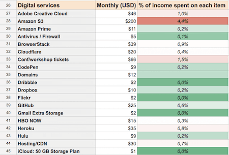
You may not know it, but maybe you’ve helped somebody in a minor but profound way. Maybe your little side project helped somebody in a time-sensitive project. Or the website you created helped somebody in a remote part of the world. Or your article made somebody change their workflow entirely. We often don’t see how much of an impact our work has on others, so we tend to focus on things we can see — numbers, figures, stats and dashboards, rather than actual people who use our so elaborately crafted interfaces.
Drop an email to a company you worked with and ask them how their site is performing. Ask people on Twitter to share their stories of how and when they use your product. Send an email to people working on the products you’re using daily, and thank them for their wonderful work in 2016.
Maintaining an effort long-term isn’t easy; it takes a lot of dedication, time, resources, and an eventual bugfixing session on late Sunday evenings. It also requires motivation and the knowledge that what you do actually matters. One fascinating story of a person using your product to solve an actual problem is worth way more than any fancy figures can provide. And that’s something tangible that will fuel your motivation, as well as the motivation of people around you for the entire new year.
Here’s one to happy stories in 2017!
— Vitaly (@smashingmag)
1. Debugging SVG Paths
Have you ever tried to debug your SVG paths? To many of us, it sounds like a crazy idea. After all, SVG is just a markup of magic numbers with paths, points, figures and a few grouped elements. Well, if you need to make a minor change in your SVG file but don’t have any vector graphic tool to fire up, you might be out of luck. Well, not anymore.
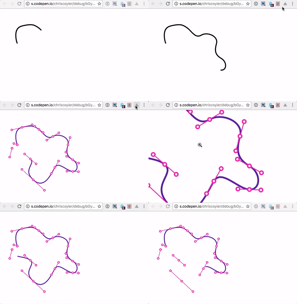
xvg is a Chrome extension for debugging SVG paths by converting them into outlines and displaying anchors, control points, handles and arc ellipses. The tool is currently in an early stage of development, so it doesn’t seem to to work properly just yet, e.g. when SVG is embedded as an <iframe> or <object>. Alternatively, you can also use the SVG Path Tester and a couple of other tools. Handy! (vf)
2. Never Stop Fighting. Ever!
While designing web experiences today, we have to consider so many unknowns and eventualities that sometimes getting things right appears to be a task that requires quite… special abilities. Yet don’t you feel like Wonderwoman or Superman when squishing that annoying bug or improving front-end performance, or making the UX process smooth at your company? Well, we do! Now, we also love sharing, and as we know from Superman, “Do good to others, and everybody can be a Superman!” That should hold true for cats, too!

Ready? Set! Go! We’d love to invite you to share your special abilities, skills, findings and experiences at our fancy SmashingConf New York 2017 convention. A 2-day-one-track-event with many smart, friendly, like-minded people willing to share and learn. The conference will be taking place on June 13–14, with Sara Soueidan, Horace Dediu, Yuko Shimizu, Jake Archibald and Eric Reiss speaking about their battles and fights and wins and losses, among others.
Early-bird tickets with a $50 discount will go live on January 31st at 10 AM EST. You know the drill: Set up your alarm clock and don’t be late! After all, superheroes are never late, and they never stop fighting evil usability no-goes and front-end bugs! ;-) (vf)
3. Detecting Outdated Browsers
Some things are so simple that they are genius. After having spent too much time optimizing for old browsers, the team at Portugal-based agency Büro decided that they needed a solution that puts an end to this. So they built Outdated Browser.
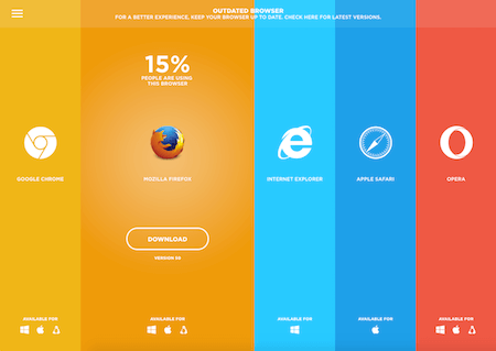
The script detects whether the browser being used by a user supports a CSS property. If it doesn’t, it displays a friendly warning at the top of the page advising them to update to a current version. It’s as easy as that. Want to give it a try? Just include the JS and CSS files in your project, paste in the required HTML and you’re good to go. (cm)
4. Implementing Vertical Rhythm
Aligning type to a vertical grid to add consistency to a page and making it look harmonious, might sound like a simple thing to do. But let’s face it, as a front-end architect, you know that the devil lies in the detail and that what sounds good, isn’t always as easy to achieve as you hoped. But help is in sight, at least when it comes to adding vertical rhythm to a page: A small .scss file called Plumber promises to do the hard work for you.
With Plumber, you won’t have to measure, shift and manually add margins and padding to set up a grid anymore. All you need to do is decide on a vertical grid height, look up the baseline ratio of your font family, and include the Plumber SASS mixin in your styles. After you’ve done that, Plumber will do the tricky maths and output everything you need as CSS. And when your project uses multiple font families, no problem, just add different baseline parameters.
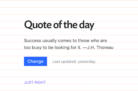
Another approach to setting up a baseline grid to improve vertical rhythm comes from Jan Dudek. Even though CSS doesn’t provide a system out of the box, he and his team managed to come up with a framework that makes it perfectly achievable to neatly lay all type — regardless of its size — on the same grid. He shares the necessary tweaks in a comprehensive write-up. (cm)
5. Auto Layout: A Sketch Plugin
Alright, so you’re probably thinking, “What? Another new plugin? But why?” Well, before you get all upset, this particular Sketch plugin is definitely not “just another plugin.” Designers have been looking for ways to define and see how their designs look like on all screen sizes, and Auto Layout (finally!) makes that possible. See? It’s a game changer.

Not only does the plugin generate an overview of all screen sizes for all artboards at once, it also integrates seamlessly into Sketch and enables defining and viewing different iPhone/iPad sizes including Portrait/Landscape. All you need to do is download the plugin (for free!) and get started right away. (il)
6. Making Your Users Happy With One Simple Rule
There has been countless research done on how customer experience can be improved, but did you know that it really all comes down to one simple psychology rule? That’s right. It is known as the peak-end rule which was popularized by Nobel Prize winner Daniel Kahneman. It has been proven that an experience is judged by the most intense point and the end point. But what does that actually mean?
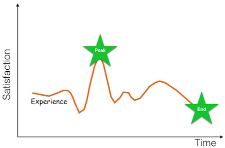
Well, if you lean back in your chair and try to remember your last holiday, what sticks to your mind most? What would you tell someone about the trip if you had to summarize it in one minute? The moments you remember well are surely the peak experiences you’ve had, along with the end experience that left an impression of the place you visited. Similarly, always remember to try and identify where a user of your product could have a peak experience and how you could amplify it. It’s really the delightful and unexpected experiences that people will appreciate for a long, long time. (il)
7. Through The Dark: An Interactive Film Experience
When his eight-year-old son Liam was diagnosed with leukemia and had to undergo chemotherapy, the Australian musician Dan Smith spent six months with him in hospital. During that time, he wrote the song “Through The Dark.” It became a story of a father and son, and of hope and fear. In a cooperation between Dan’s band Hilltop Hoods and Google Play Music, the song was now brought to life in an interactive film experience that uses mobile technology to capture a world turned upside down. And, well, it turned out nothing less as mind-blowing.
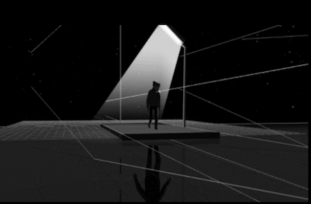
The experience consists of two worlds — the dark and the light — representening the feelings of fear and hope that father and son went through. You follow along on their journey through these extremes, switching between both worlds as you tilt your device. The animation is powered by WebGL, simplified 3D meshes and rings were built to tell the story, textures and lightning designed by hand. A technical masterpiece that revives this intense period in the life of father and son and gives hope to others whose world is turned upside down, too. (cm)
Inspiration, Freebies, Misc.
- Breaking Out Of The Box: Design Inspiration (January 2017)
- Becoming A Better Facilitator
- The Ultimate Digital Clean-Up Checklist: Are You Prepared For The New Year?
- Web Development Reading List #163: The End-Of-Year Wrap-Up
- Web Development Reading List #164: Enjoy The End Of 2016, It Wasn’t The Worst
- Tech Advent Calendars For Web Designers And Developers In 2016
That’s All, Folks!
Thank you so much for reading and for your support in helping us keep the web dev and design community strong with our newsletter. See you next time!
Smashing Newsletter
Useful front-end & UX bits, delivered once a week. Subscribe and get the Smart Interface Design Checklists PDF — in your inbox. 🎁
You can always unsubscribe with just one click.
Previous Issues
- UX Mapping and Service Blueprints
- Designing Voice UX
- New CSS Features and Techniques
- Designing For Complex UIs
- Hidden Gems of the Web
- Web Performance 2026
- Designing Surveys
- Accessibility and Inclusive Design
- Interface Design Patterns
- UX Research Strategies and Tools
Looking for older issues? Drop us an email and we’ll happily share them with you. Would be quite a hassle searching and clicking through them here anyway.

