April 11, 2017 Smashing Newsletter: Issue #178
This newsletter issue was sent out to 231,624 newsletter subscribers on Tuesday, March 21st 2017. Editorial Nobody likes major changes, and so major redesigns never go unnoticed. With the announcement of the open beta of the shiny new Smashing Magazine last week, we were literally overwhelmed with feedback, ranging all the way from surprise and delight to shock, concerns and skepticism.
We’ve been introducing significant changes both technically and visually.

This newsletter issue was sent out to 231,624 newsletter subscribers on Tuesday, March 21st 2017.
Editorial
Nobody likes major changes, and so major redesigns never go unnoticed. With the announcement of the open beta of the shiny new Smashing Magazine last week, we were literally overwhelmed with feedback, ranging all the way from surprise and delight to shock, concerns and skepticism.
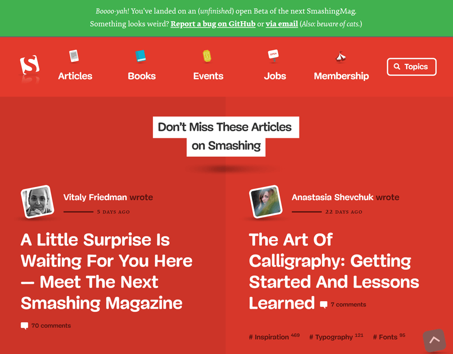
We’ve been introducing significant changes both technically and visually. We removed the back-end altogether. Instead, static HTML, advanced JavaScript APIs, running as a progressive web app with a service worker in the background and blazingly fast performance — served from a CDN near you. Instead of pushing advertising over the edge, we’ve taken the drastic decision of removing advertising almost entirely, focusing instead on featuring our lovely products. Visually, we have rediscovered what Smashing Magazine means and how it’s perceived, and fully embraced the quirky, informal personality that we developed over the years.
Indeed, our new journey is quite radical, and there are many reasons that prompted us to introduce major changes. One of them is the unbeatable performance benefit of static sites. Another reason is the dysfunctional advertising ecosystem which doesn’t sustain the magazine any longer. Yet another is the unique chance to design a truly smashing experience from start to finish, with the entire stack running on good ol’ HTML, CSS and JavaScript — all progressively enhanced.
We’re not stubborn though. We’ve been listening to the concerns, bugs and issues raised, and we’ll be working to improve the overall experience over the next weeks and months. Not everything is set in stone already, and I am eternally grateful for your fantastic feedback so far, and your kind support in our little journey. We’ll be sure to keep you informed of the next steps, and we’ll even have a couple of articles coming up to explain what exactly is happening behind the scenes!
Never stop learning, and stay smashing!
Vitaly (@smashingmag)
Table of Contents
- The Inbox Of Forgotten Emails
- Home Sweet Freiburg
- How To Design Clean And Fuss-Free APIs
- Meet Zwizz, A Free Sans-Serif Font
- A Playground For CSS Animations
- Tiny Words Matter
- Inspiring Podcasts For Designers And Developers
- Storytrail: A Digital Travelling Experience
- The Boat: A Powerful Piece Of Storytelling
- Upcoming Smashing Workshops
- New On Smashing Job Board
- Smashing Highlights (From Our Archives)
- Recent Articles On Smashing Magazine
1. The Inbox Of Forgotten Emails
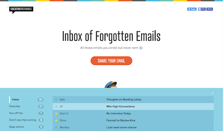
Remember that time when you wanted to send that angry email to your colleague, but you never did? Or those desperate words intended for your ex that didn't make it out of the "Drafts" folder? Well, there's now a place for all those embarrassing email writing moments that never reached their recipients.
An idea brought to life by Creative Mornings and Mailchimp, the "Inbox Of Forgotten Emails" puts all those thoughts, feelings, and confessions into the spotlight that we had a hard time sharing. Some of the exhibits are plain funny (the "Sauce Hollandaise Confession," for example), some so relatable that you could sign them off without hesitation, others simply touching. If you happen to have an email lurking in your Drafts folder that you didn't have the courage to send off, then feel free to contribute it to the project. No worries, anonymously, of course. (cm)
2. Home Sweet Freiburg!
We are all craftsmen in a way, no matter if you create delightful experiences, snappy performances, or innovative products. While our tools now fit into the thinnest laptops or even the cloud, we still have much in common with the stonemasons and the carpenters who lived centuries before us. We have to share our knowledge in order to get better and smarter at what we do. Like in a guild.
And what place could be better for a guild of web designers and developers to get together for a friendly conversation, to learn from each other and to spark new ideas as a location that lives and breathes centuries of crafted skills? We are headed back to the Historic Merchants' Hall in our lovely hometown Freiburg, and we'd love you to join us there for SmashingConf Freiburg 2017.
Taking place September 11th and 12th, this conference will be two days of jam-packed real-live web design problems and techniques that you can immediately apply to your work. Umar Hansa, Alla Kholmatova, Scott Helme, Rachel Andrew, and Mathias Biilmann are among the first confirmed speakers and more will be announced shortly. Sound good? Well, tickets will go on sale Tuesday March 28, at 14:00 CET (8 AM EST). So, don't forget to set your alarm clock — tickets are limited! See you in Freiburg! (cm)
3. How To Design Clean And Fuss-Free APIs
APIs might seem simple to create, but once you dive deeper, their real complexity crops up. A lot of them are simply hacked together from internal services, i.e. “undocumented spaghetti monsters” that pile up technical debt and make the lives of the developers who have to work with them unneccessarily hard. But you know what? You can do better!
A good companion through your API endeavours is Erich Reich’s comprehensive guide To API Design. It takes you through the necessary steps to build a good, clean footing from scratch or to refactor an existing API into something more manageable. And if that’s not enough for you yet, Rodney Rehm also put together a timeless how-to of designing better JavaScript APIs some time ago. An oldie but goodie sharing the most important things you have to consider when writing utilities or libraries, so that they are accessible and fuss-free to use for fellow devs. Because, well, that’s what we all wish for, right? (cm)
4. Meet Zwizz, A Free Sans-Serif Font
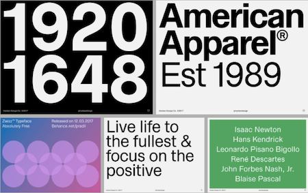
Sans-serif, compact, perfect for diacritic-heavy languages. That’s Zwizz, a new free front designed by Alfredo Marco Pradil. And, well, with its horizontal and vertical termination cuts that remind us of the all-time classic Helvetica, Zwizz does indeed feel a bit Swiss.
Its compact design makes Zwizz a good fit for tight typographic compositions. Especially when set in bold on large font sizes, the typeface knows how to make a statement, at the same time it masters the art of stepping a step back in running text to give the textual content the room it needs to breathe. A timeless piece. (cm)
5. A Playground For CSS Animations
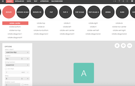
Wouldn’t it be cool to have something like a playground where you can play around with CSS animation? Just to see what effect a different delay or duration would have on your animation, for example? That’s essentially the idea behind Animista. Ana Travas, the creative mind who brought the library to life, wanted to provide a meaningful and accessible way to test and tweak pre-made animations so you can easily reuse them in your own projects.
Animista offers a lot of customization options, from entrances and exits to text and attention-grabbing wobble effects, even background color changes. Just tweak them to your heart’s content, and, if you like what you see, copy and paste the code and you’re good to go. Handy! (cm)
6. Tiny Words Matter
It’s the small details that make a difference. A friendly error message, a witty tooltip, a placeholder that makes you chuckle. Microcopy might be a small part of your design, but one you shouldn’t underestimate. So how about some inspiration to polish up your little text snippets? Tiny Words Matter has some stellar examples that are bound to cater for fresh ideas.
The showcase curates microcopy findings from all over the web, from buttons, labels, error messages, placeholders, tooltips, even URLs. And, well, there are some real treasures to discover. A logout screen that has the URL /see-ya-later (seen on Mailchimp), for example, a placeholder in an email form field with dana.scully@fbi.gov (Trello), or an onboarding process that promotes the site’s app with the words “Congratulations. Now you’re a real user. You deserve an app.” (Tumblr). Crafting such little sparks of delight isn’t hard, but they are a small puzzle piece that can leave a lasting impression and top off an already great user experience. (cm)
7. Inspiring Podcasts For Designers And Developers
Listening to fellow designers and developers share their stories is a great way to find new inspiration. And, well, could there possibly be a more comfortable way to indulge in these kinds of things as with a podcast? If you’re on the hunt for a new favorite podcast or eager to tune into something different for a change, the selection of podcasts which Design & Development Tomorrow curated has got you covered.
Their list is divided into “podcasts for designers” and “for developers” and offers the right material for any type of listener, no matter if you’re interested in responsive web design, design and front-end news, UX, the future of the web, interviews or book reviews. Worth checking out. (cm)
8. Storytrail: A Digital Travelling Experience
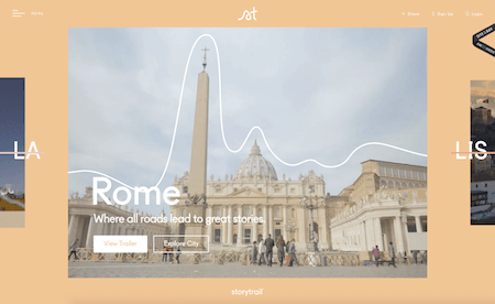
The travel bug often bites when you don’t have the time or the money to go on a journey. But there’s something that could ease the wait until your next vacation — at least a bit: Storytrail. Storytrail lets you explore the world’s greatest cities in little videos. Your tour guide: world traveller and co-founder Jason.
Jason will guide you through the must-sees and hidden gems of New York, San Francisco, LA and Rome (Lisbon and London will follow in summer) and tell you their curious, weird and wonderful stories. Stories about flying donkeys, buried ships, and the basement of horror, for example. What makes the experience so special is that the videos are laid out like actual walking trails through different neighborhoods so you’ll actually feel a bit as if you’re strolling through the scenic alleys, buzzing streets or sunny piazzas yourself. By the way, the site is also a great example of well-done responsive art direction: Depending on the width of your browser window, you get to see a broader or a narrower view of the scenery. Now excuse us please, we’re off to some lunchbreak travelling. (cm)
9. The Boat: A Powerful Piece Of Storytelling
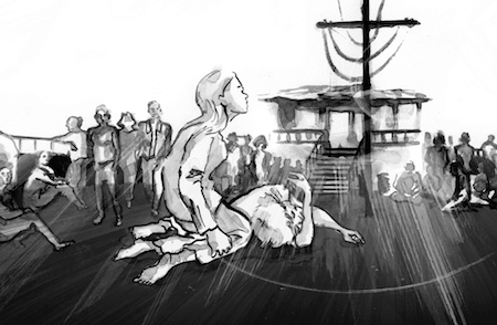
Some stories are so dense, so intense, that they capture you and don’t let you go. “The Boat” is such a story. Based on the short story by Nam Le, “The Boat” combines animation, audio, and ink and charcoal drawings into a powerful, interactive graphic novel.
The story told is the one of Mai, a girl whose parents send her alone on a boat to Australia after the Vietnam War. And, well, the storytelling experience really is exceptional. Each little element, each thoroughly applied animation contributes to creating an atmosphere that reflects the fear, despair, but also the hope that is linked to the escape. Take some time and see for yourself. It’s worth it. (cm)
10. Upcoming Smashing Workshops
With so many techniques, tools, style guides, design patterns, strategies, abstractions, frameworks and boilerplates available nowadays, what do you really need to know to keep your workflow fast, smart and efficient? That's exactly what our classes are all about: practical front-end and RWD workshops that will help you become better front-end developers and designers, today.
Workshops at SmashingConf San Francisco (April)
- Building Performant Websites – Tim Kadlec
- Hands-On Checkout Optimization Workshop – Christian Holst
- Advanced SVG Animation – Sarah Drasner
- Advanced CSS Layouts With Flexbox And CSS Grids – Rachel Andrew
- Creative Data Visualization Techniques – Nadieh Bremer
Workshops at SmashingConf New York — June 12
- Atomic Design: Process & Patterns – Brad Frost
- Good Ideas Make Great Illustration – Yuko Shimizu
- Persuasive Design – Horace Dediu
- The Modern Front-End Workflow Bootcamp – Umar Hansa
- Smart UX Design Patterns – Vitaly Friedman
Workshops at SmashingConf New York — June 15
- An Introduction To Service Design – Eric Reiss
- How to Design With Science Without Losing The Magic – Joe Leech
- Mastering SVG – Sara Soueidan
- New Front-End Adventures in Responsive Design – Vitaly Friedman
Public Workshops with Vitaly Friedman
- Toronto, Canada • Smart Responsive Design Patterns
FITC Toronto, Apr. 22nd, 2017 - Sydney, Melbourne, Brisbane — Australia • Smart Responsive UX Design Patterns, Web Directions, May 4–12, 2017
Or, if you’d like to run an in-house workshop at your office, feel free to get in touch with Vitaly at vitaly@smashingconf.com and briefly describe what problems you’re facing and would like to solve. Don’t worry about the costs — we’ll find a fair price for sure. Get in touch — it’s that easy!
11. New On Smashing Job Board
Here are the recent job openings published on our Smashing Job Board:
- Senior Experience Design / UXD – Financial Industry at Logic State LLC (New York)
“This is a full time contract position. Logic State's client base is predominantly composed of banking and insurance industry clients. Candidates that possess experience with enterprise sites involving the presentation of banking concepts and financial information are highly preferred.” - Front-End Designer at We Make Websites (London)
“We are looking for a talented and dynamic front-end designer to help us build beautiful e-commerce websites for fashion forward brands. Someone who really cares about the client journey and final result, not just getting the job finished on time. We are the world's most trusted Shopify Plus agency, so we're looking for people that can design polished e-commerce experiences that are visually stunning on all screen sizes.” - Web Designer at U.S. News & World Report (Washington)
“This position requires an excellent eye for design, coupled with a keen ability to understand user needs, behaviors, and motivations. You should have strong Photoshop/Illustrator skills and be comfortable with HTML/CSS. Strong organizational and communication skills, attention to detail, and ability to meet deadlines are also required.”
12. Smashing Highlights (From Our Archives)
- How To Integrate Motion Design In The UX Workflow
With the ever-increasing computing power of desktops, browser sophistication and use of native apps, every day we learn of new ways to push the limits of what defines a well-crafted UI. When used correctly, motion can be a key utility in helping your users achieve their goals. - Hex Colors: The Code Side Of Color
The trouble with a color's name is that it never really is perceived as the exact same color to two different individuals — especially if they have a stake in a website's emotional impact. Name a color, and you're most likely to give a misleading impression. Even something like "blue" is uncertain. To be more precise, it could be "sky blue", "ocean blue", "jeans blue" or even "arc welder blue". - Passing The Holy Milestone: How To Meet Deadlines
For too many projects, there comes a time when every action taken, every decision and sacrifice made, is spurred on by pressure to finish. Tempers seem to shrink along with the available days, talk about "high standards" gives way to "good enough," and people realize that deadlines are aptly named.
13. Recent Articles On Smashing Magazine
Design Articles
- The Beauty Of Imperfection In Interface Design
- How To Spark A UX Revolution
- Sketch Vs. Figma: The Showdown
Coding Articles
- Beyond The Browser: From Web Apps To Desktop Apps
- Prototype And Code: Creating A Custom Pull-To-Refresh Gesture Animation
- How To Develop An Interactive Command Line Application Using Node.js
- How To Simplify Networking In Android: Introducing The Volley HTTP Library
Inspiration, Freebies, Misc.
- A Little Surprise Is Waiting For You Here.
- World Wide Web, Not Wealthy Western Web (Part 2)
- Free Sparkly Icons To (Literally) Make Your Designs Shine (30 Icons, EPS, SVG)
- How To Deliver Large-Scale Projects Using A Content Hub Strategy
- Web Development Reading List #173: CSS Grid Support, A Virtual DOM Alternative, And Designing Better Cards
- Web Development Reading List #174: The Bricks We Lay, Remynification, And 0-RTT
Smashing Newsletter
Useful front-end & UX bits, delivered once a week. Subscribe and get the Smart Interface Design Checklists PDF — in your inbox. 🎁
You can always unsubscribe with just one click.
Previous Issues
- UX Mapping and Service Blueprints
- Designing Voice UX
- New CSS Features and Techniques
- Designing For Complex UIs
- Hidden Gems of the Web
- Web Performance 2026
- Designing Surveys
- Accessibility and Inclusive Design
- Interface Design Patterns
- UX Research Strategies and Tools
Looking for older issues? Drop us an email and we’ll happily share them with you. Would be quite a hassle searching and clicking through them here anyway.

