April 25, 2017 Smashing Newsletter: Issue #179
This newsletter issue was sent out to 231,209 newsletter subscribers on Tuesday, April 11th 2017. Editorial Whenever we invite designers and developers to speak at our conferences, it’s always because we sincerely believe they have something valuable to share with the community: Insights, experiences, failures, successes, and lessons learned in small as well as large projects. Having a diverse line-up of speakers has always been important to us, and we take pride in not giving up easily — sometimes chasing speakers until it becomes remarkably difficult to say “No.

This newsletter issue was sent out to 231,209 newsletter subscribers on Tuesday, April 11th 2017.
Editorial
Whenever we invite designers and developers to speak at our conferences, it’s always because we sincerely believe they have something valuable to share with the community: Insights, experiences, failures, successes, and lessons learned in small as well as large projects. Having a diverse line-up of speakers has always been important to us, and we take pride in not giving up easily — sometimes chasing speakers until it becomes remarkably difficult to say “No.”

A lot of communication goes on behind the scenes, and usually planning an event means planning way ahead of time. For San Francisco, we tried very hard to make sure that our dear friend and colleague Sara Soueidan from Lebanon could speak at the conference, despite the recent travel ban in the US. Sara has been through a tedious visa issue in the past already, but Marc was stubborn enough not to give up. We're happy to have convinced Sara to still come and speak despite of all the ongoing issues that might occur along the way. She wasn't allowed to take a laptop on the plane, but she still was able to share her insights from a friend's laptop on stage.
Sara will also be speaking at SmashingConf New York, and she'll be running her brilliant SVG workshop as well. As a conference organizer, don't get discouraged by the limitations imposed by authorities or rumours, and keep on bringing good people to great events — events with a fantastic, caring community around it. The community support for Sara was remarkable, and we know that we are doing the right thing. If something happens to your event, we'd be happy to step up — it's worth it.
Stay stubborn!
– Vitaly @smashingmag
Table of Contents
- Popular Brand Logos As SVGs
- Mastering CSS Grid Layout
- Custom Font-Face Code Made Easy
- Service Workers: Guides, Tutorials, And Copy-Paste Snippets
- Freebie: Editable And Scalable Vector Emoji
- Saving GitHub Issues Offline
- The State Of Email
- Making The Web A Better Place
- Loopy: A Tool To Visualize Complex Systems
- An Alphabetical Adventure
- Upcoming Smashing Workshops
- New On Smashing Job Board
- Smashing Highlights (From Our Archives)
- Recent Articles On Smashing Magazine
1. Popular Brand Logos As SVGs
Every now and again, you need to include a brand logo in a mock-up. Not only the common social media icons but also assets that are less common, like the logo of a certain online service, a programming language, banking provider, or an app maybe. If you need a brand logo next time, be sure to check Simple Icons — chances are they have what you're looking for.
Maintained by Dan Leech, the site features a huge collection of more than 300 SVG brand icons ranging from big players and online services like Google, Instagram and MasterCard to programming languages, browser vendors, apps, and everything else tech- and web-themed. A nice bonus: Simple Icons also provides you with the matching hex color code for each logo. And if you're looking for a logo that isn't part of the collection yet, you can make contributions and requests via GitHub. One for the bookmarks. (cm)
2. Mastering CSS Grid Layout
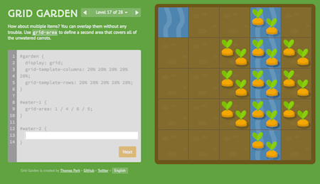
Easter is just around the corner, and, well, what better way could there be to make an Easter bunny happy as with some tasty carrots? To plant the carrots, however, you need a special skill, but none you can't master, we're sure of that: CSS Grid. To teach us the basics of it, Thomas Park came up with Grid Garden, a browser game in which you need to write CSS code to grow — you probably guessed it already — carrots.
There are 28 levels in total and each one has a little challenge you need to master to make your garden flourish — using grid-column-start to water the areas of the garden that have carrots, for example, or to kill the weeds so that your plants can grow nicely. The tasks will get harder as you approach, of course.
Once you've grown familiar with CSS Grid and are ready to use it out in the wild, be sure to take a look at Anthony Dugois' CSS Grid Template Builder and Drew Minns' Griddy. Tools help you build layouts by providing you with the necessary templates and a visual interface to see the layout in action. Handy!(cm)
3. Writing @Font-Face Declarations Made Easy
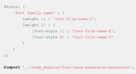
Writing @font-face declarations can be a tedious task that requires a lot of repetitive typing. Just think of the mass of code you need to write just to define each font weight and font style you want to add to your site. A remedy now comes from Daniel Tonon. His font-face-generator npm package handles all the repetitive @font-face styling for you.
All you have to do to get things up and running is import the file, and after you've assigned some custom settings, you can enjoy the magic behind the little SCSS-powered helper. Instead of typing the usual string of code for each font weight and style individually, you only enter a minimum of information and the $fonts variable generates the CSS code from it. It even works with multiple fonts. A real time saver. (cm)
4. Service Workers: Guides, Tutorials, And Copy-Paste Snippets
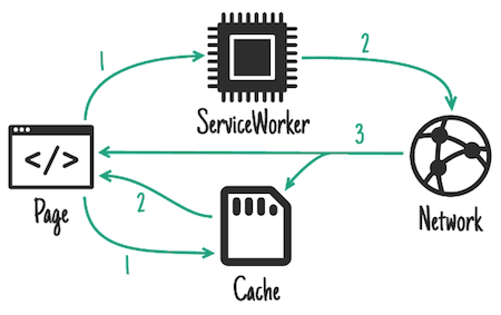
To create reliable, fast experiences on the web, there's no getting around service workers. But where to begin if you want to implement them on your site? We've collected some helpful guides, tutorials, and copy-paste snippets that are bound to make your service worker endeavor a lot smoother. One of them is Jake Archibald's Offline Cookbook.
Just like in a real cookbook, Jake provides different recipes for different occasions. What kind of caching patterns are suitable for what kind of content (static content, dynamic content, bigger resources that aren't needed right away, for example)? And how exactly are requests handled? The tutorial also provides tips for using service workers in combination with the Push API and for implementing a "Save for offline" button so users can select the content they want available offline themselves. Handy!
Another valubale resource comes from Lyza Danger Gardner. After giving her "The Pragmatist's Guide To Service Workers" talk at last year's SmashingConf Freiburg, she collected the accompanying code examples in a GitHub repository. They cover everything from providing an offline message and responding to fetches for content and static assets differently to adding a fallback offline image. And if you're looking for even more practical examples of service worker usage, check out the ServiceWorker Cookbook that Marco Castelluccio put together on GitHub with service worker recipes that illustrate a number of APIs. Suitable for both beginners and experts. (cm)
5. Freebie: Editable And Scalable Vector Emoji
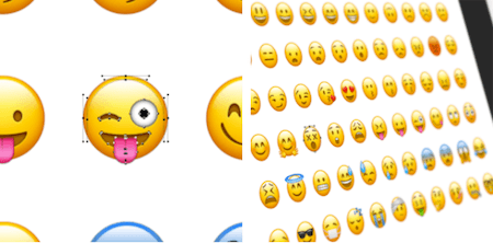
Who doesn't love emoji? Well, here comes good news if you can't get enough of the little yellow guys with their smirks, puzzled looks, and rosy cheeks. Thanks to Michael Flarup who recreated 68 popular smileys as layered PSDs, you can now scale and edit the round fellows to your liking. For free.
Design-wise, the vector versions appear just as you know the emoji from Apple platforms, and, in fact, all the familiar faces are included in the Photoshop kit spreading their joy, mischief, anger, and despair and pretty much every other feeling you can think of. Yes, even the nerdy guy with the rabbit teeth and the friendly poop join the fun. Happy editing! (cm)
6. Saving GitHub Issues Offline
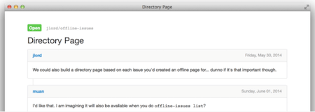
Wouldn't it be great if you could work on fixing GitHub issues even when you're offline? When travelling with a bad internet connection, or on a plane, for example? Well, actually you can. A little Node.js helper called offline-issues makes it possible.
The command line application fetches the GitHub issues you specify and conveniently saves them in HTML and Markdown formats on your computer. You can even decide if you want to make one issue, all issues or multiple respositories and issues available offline. Filtering for open or closed issues is also possible. To use the tool, you need to have Node.js installed on your computer. Convenient. (cm)
7. The State Of Email
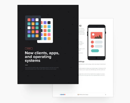
Let's face it, designing for email can be tough. Email client rendering quirks, spam flagging, getting lost in the shere mass of emails users receive these days — if you're sending out newsletters or are doing email marketing, you know the pitfalls that email brings along. To help us stay on top of trends in all things email, Litmus has been publishing their annual State Of Email Report for a few years already, and, well, the 2017 edition is now here and just as useful as always.
Over the past year, Litmus tracked 13 million email opens and distilled valuable knowledge about new and updated email clients from them just like tips to make your email stand out from the crowd. Among other things, their State Of Email report dives deep into mobile, webmail and desktop trends and sheds a light into the things you need to know to avoid spam complaints. Practical tips for streamlining your email workflow and automating the more mundane aspects of email creation so that there's more room for experiments (think personalization, dynamic content, and gamification, for example) are also part of it. Definitely worth a read. (cm)
8. Making The Web A Better Place
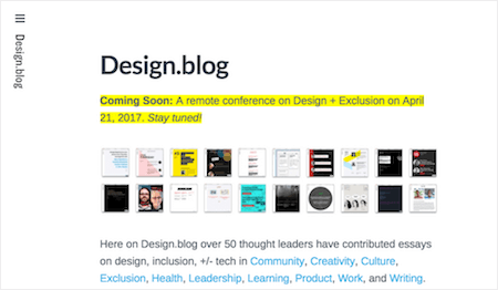
In a fast-moving industry like the web industry, staying on top of current trends and developments is key. But despite all the excitement for hot new technologies, techniques, and tools, we shouldn't forget about the more human aspects of our work either — the community, diversity, and workplace culture, for example. Design.blog provides a place for all those things that often get lost in this loud industry oh so easily.
The blog shares essays of over 50 thought leaders, their voices on design, inclusion and tech. A good opportunity to consider the power and relevance of inclusion, not only when designing and working but in our lives in general. (cm)
9. Loopy: A Tool To Visualize Complex Systems
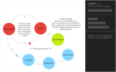
We are surrounded by complex systems — not only seen from a technical perspective, but in every other aspect of our lives, too, be it social, political, economical, or environmental. Grasping how the different parts of these systems interact and how they depend from each other can already be hard. However, if you need to explain them, things get even more challenging.
A new tool that can provide a solution for all those occasions when you need some visual aid to explain a complex system is Loopy. Loopy lets you create explorable diagrams simply by drawing circles and connections with your mouse. No need to install anything, it all happens right in the browser. Easy as pie. (cm)
10. An Alphabetical Adventure
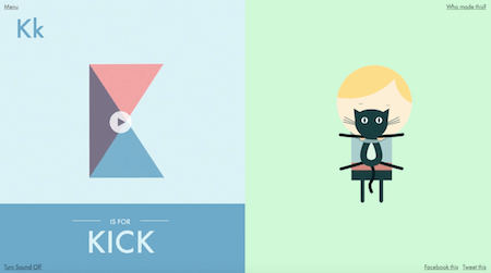
"A" is for "Albert", "B" is for "Bounce", "C" for "Cowabunga". If you have no idea what this all is about, well, no worries, we'll tell you: it's the beginning of a very special piece of eye candy. Brought to life by design agency Studio Lovelock, "A Is For Albert" explores the moments of happiness and the little mishaps that life with kids brings along — with an animated alphabet.
Each letter from A to Z tells the story of how Albert, a blonde little boy, explores the world in his own cute yet chaotic (and seen from his parents' perspective sometimes maybe even a bit annoying) way. He decorates the livingroom wallpaper with his brush artworks, for example, and shows his love for the family cat by hugging it a bit too tight. Simple geometric shapes and a soft color palette are everything the project needs to breathe life into Albert's (and his parents') everyday adventures and make us smile. (cm)
11. Upcoming Smashing Workshops
With so many techniques, tools, style guides, design patterns, strategies, abstractions, frameworks and boilerplates available nowadays, what do you really need to know to keep your workflow fast, smart and efficient? That's exactly what our classes are all about: practical front-end and RWD workshops that will help you become better front-end developers and designers, today.
Workshops at SmashingConf New York — June 12
- Atomic Design: Process & Patterns – Brad Frost
- Good Ideas Make Great Illustration – Yuko Shimizu
- Persuasive Design – Horace Dediu
- The Modern Front-End Workflow Bootcamp – Umar Hansa
- Smart UX Design Patterns – Vitaly Friedman
Workshops at SmashingConf New York — June 15
- An Introduction To Service Design – Eric Reiss
- How to Design With Science Without Losing The Magic – Joe Leech
- Mastering SVG – Sara Soueidan
- New Front-End Adventures in Responsive Design – Vitaly Friedman
Workshops at SmashingConf Freiburg — September 10
- Smart UX Design Patterns – Vitaly Friedman
Workshops at SmashingConf Freiburg — September 13
- Modular Design – Alla Kholmatova
- Modern Front-End Workflow Bootcamp – Umar Hansa
- Advanced CSS Layouts With Flexbox and CSS Grids – Rachel Andrew
Public Workshops with Vitaly Friedman
- Toronto, Canada • Smart Responsive Design Patterns
FITC Toronto, Apr. 22nd, 2017 - Sydney, Melbourne, Brisbane — Australia • Smart Responsive UX Design Patterns, Web Directions, May 4–12, 2017
Or, if you’d like to run an in-house workshop at your office, feel free to get in touch with Vitaly at vitaly@smashingconf.com and briefly describe what problems you’re facing and would like to solve. Don’t worry about the costs — we’ll find a fair price for sure. Get in touch — it’s that easy!
12. New On Smashing Job Board
Here are the recent job openings published on our Smashing Job Board:
- Mobile UIUX/Motion designer at Touchlab (New York)
“As an experienced UIUX/Motion designer, you have a deep understanding of mobile design patterns and you're fluent in the design languages of both Android and iOS. You know the rules and know how to break them to create amazing interfaces centered around the user.” - UI Designer at Achievement Network (Boston, MA)
“We are looking for a talented UI Designer to create visual design (storyboards/prototypes, proof of concepts and content layout) and information architecture (site structure/organization, navigation/findability etc.) for ANet's online assessment creation, delivery, reporting and resource applications.” - Full Stack Developer at Superrb (Hayling Island, Hampshire, UK)
“You're an experienced web developer. Your code is tidy and your stack is phat. You know the drill but you're willing to experiment. You're borderline geek and so are we. But your ability to communicate with humans as well as computers keeps you from full nerd metamorphosis. And critically your eye for what looks hot makes you the perfect fit for our studio.”
13. Smashing Highlights (From Our Archives)
- How To Stop Designing For Ourselves
How often do we look at a website or app and remark to ourselves (and on Twitter) that "these designers must have been blind!" Sometimes we're just being whiney about minute details (as we should be), but other times we do have a point: "What were they thinking?" - When You Learn Something, Write About It!
Noone can deny that the Web has changed the way people teach, learn, and do research. Of course, this doesn't mean that everything we read online is true and accurate — far from it. But through honest discussion and objective collaboration, accurate and useful information is much more likely to be the end result of any educational endeavor. - Understanding The Difference Between Type And Lettering
Coming out of the grunge, graffiti and David Carson era through the '90s, there has been a major resurgence of interest in typography. We have seen a number of designers and artists make their careers out of designing type or custom lettering, and it has become common to list typography among our skills and disciplines. Unfortunately, as with any popularity surge, there have come with it a lot of misunderstandings of some of the terms and concepts that we use.
14. Recent Articles On Smashing Magazine
Design Articles
- Filling Up Your Tank, Or How To Justify User Research Sample Size And Data
- Understanding Stacked Bar Charts: The Worst Or The Best?
- The Road To Resilient Web Design
Coding Articles
- A Comprehensive Guide To HTTP/2 Server Push
- Creating One Browser Extension For All Browsers: Edge, Chrome, Firefox, Opera, Brave And Vivaldi
- How To Set Up An Automated Testing System Using Android Phones (A Case Study)
- How To Secure Your Web App With HTTP Headers
- Building For Mobile: RWD, PWA, AMP Or Instant Articles?
- Improve Your Billing Form's UX In One Day
Inspiration, Freebies, Misc.
- A Comprehensive Guide To E-Commerce Platforms
- 50 Vibrant Illustrations To Let Your Mind Wander
- Blooming Colors And A Bit Of Magic: Wallpapers To Get Your Ideas Springing (April 2017 Edition)
- Home Sweet Home: Meet SmashingConf Freiburg 2017
- Web Development Reading List #175: GraphQL, IndexedDB2, And An Open Ethical Internet
- Web Development Reading List #176: Safari 10.1, Prompt()-Deprecation, And Professional Pride
- Web Development Reading List #177: Getting Started With Components, CT-Header, And New Regular Expressions
Smashing Newsletter
Useful front-end & UX bits, delivered once a week. Subscribe and get the Smart Interface Design Checklists PDF — in your inbox. 🎁
You can always unsubscribe with just one click.
Previous Issues
- UX Mapping and Service Blueprints
- Designing Voice UX
- New CSS Features and Techniques
- Designing For Complex UIs
- Hidden Gems of the Web
- Web Performance 2026
- Designing Surveys
- Accessibility and Inclusive Design
- Interface Design Patterns
- UX Research Strategies and Tools
Looking for older issues? Drop us an email and we’ll happily share them with you. Would be quite a hassle searching and clicking through them here anyway.

