
May 23, 2017 Smashing Newsletter: Issue #181
This newsletter issue was sent out to 229,582 newsletter subscribers on Tuesday, May 9th 2017.

Editorial
Constraints. Great ideas usually come unexpectedly, and sometimes when you are forced into creating something within a limited amount of time, creativity is the only way to break out of the imposed boundaries. In design, we tend to use “mobile first” to bring a sharp focus to our design and radiate our experience from the core messages we want to communicate. We might be looking into mobile, small, portrait, slow, interlace, monochrome, coarse, non-hover first, which is a good starting point for any bulletproof and resilient experience.
However, we need to know what exactly we are building first. One of the very first things we do when starting a new project is to explore the specifics of the content as well as the content types that we are supposed to deliver. Every interface can be broken down into content modules, responsively re-arranged, and scaled up and down according to the designer’s intent. So, why don’t we design something as seemingly obvious and trivial as error messages first? In many ways, these open the door to an understanding and purpose of what we are designing for while showing the way we frame and shape the visual language to communicate that exact purpose.
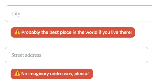
“Designing” the interface in a text editor forces you to fully comprehend what you are about to design, and helps formulate goals and the language of a project respectively. That’s why some companies hire professional stand-up comedians to write the first draft of copy so to communicate a message in a clever and memorable way. Once you have the tone and voice settled, you can translate it into an appropriate visual form regarding type, color, and iconography — be it mobile, desktop or both — and proceed to technicalities afterward.
It’s all about gathering precisely the right understanding of what is in front of you and finding just the right angle to address your client’s current problems. Once you have achieved this, you have a guiding rule to constrain your design and technical decisions, and that can be very beneficial to any process.
Embrace boundaries just to break out of them.
Cheers from Melbourne,
Vitaly (@smashingmag)
Table of Contents
- Office Design By An Office Hater
- Enter The Next Level Of Front-End: SmashingConf Barcelona Is Coming!
- An Interactive Map Of Typefaces
- Designing With Real Content Made Easy
- A Color Blindness Simulator For Sketch
- Italian Graphic Design At Its Best
- A Pure CSS Crossword
1. Office Design By An Office Hater
Do you feel comfortable in the office you work in? Or do you feel it’s too loud, too crammed, too hot or maybe too cold? Well, you’re not alone. Office spaces are often created with representative reasons in mind, the people who work there have to adapt. But let’s be honest, open floor plans, randomly distributed work stations and meeting spots sprinkled within aren’t fostering an atmosphere in which knowledge workers can undisturbedly do what they are supposed to do: think.
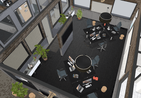
Markus Tacker, software developer, hates offices for exactly these reasons. But instead of complaining, he set out to do better and created a 3D model of his ideal office. The key idea behind his design: To create dedicated spaces for different purposes that don’t interfere with each other and, thus, keep distraction to a minimum. The offices are designed for three people (or six if team size requires it), for example, with walls shielding the tables from the entrance to reduce visual noise. You’ll also find dedicated places for one-on-one meetings just like a social space which brings everyone together during lunch time or for a quick standup, of course. Warm colors, natural materials and plants also help cater for an inspiring atmosphere. Now who wouldn’t love to work there? (cm)
2. Enter The Next Level Of Front-End: SmashingConf Barcelona Is Coming!
The web is constantly changing. So, what could be better than learning first-hand from people who know their craft? Well, SmashingConf Barcelona is returning to the magical Palau de la Música Catalana once again this fall (October 17th and 18th) to boost your front-end game. Two packed days of hands-on, practical sessions by some of the most respected members of the community.

Join us on our journey to the sunny Mediterranean seaside where we’ll explore new front-end challenges, UX strategies, and design patterns that can immediately be applied to your work. No fluff or theory, just things that have worked in real-life projects — with enough time for networking, of course. Tickets are now on sale. See you there? (cm)
3. An Interactive Map Of Typefaces
The potential of machine learning is huge. But what can be done with it already today? The team at IDEO wanted to find out how they could use maching learning to address one of the most common challenges that designers usually face: choosing a font. And, well, their experiment was successful indeed.
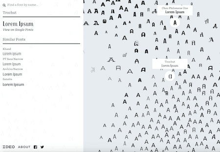
Font Map, as the endeavour is called, is an interactive map of more than 750 fonts that are organzied by a machine learning algorithm based on their visual characteristics. As designers usually tend to fall back on fonts they used before or start their search within categories, Font Map provides an opportunity to think outside the box and explore fonts in an entirely new, unbiased way. And in case you’ve already got a font on your mind that could make a good fit for your project, you can also use the tool to search for it and find similar alternatives. Clever! (cm)
4. Designing With Real Content Made Easy
Nothing beats designing with actual data. It caters for real-life conditions and helps you detect weak spots in your design already in the mockup phase. And thanks to Julien Perriere, doing so now became just as painfree as using the good ol’ lorem ipsum.
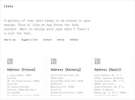
How? Well, Julien bundled real content conveniently together into lists. Lists with names, lists with prices, lists of countries, addresses, credit card numbers, email subjects, and much more. In fact, whatever else you can think of, there’s probably a list for that. He describes the collection as “an App Store for fake content”, advocating that inserting the content into your mockup shouldn’t take up more time as designing it. True. One for the bookmarks. Ah, you could also use Content Generator Sketch plugin and Craft for InVision. (cm)
5. A Color Blindness Simulator For Sketch
Accessibility matters and should be treated with the same attention and care as every other aspect in the design process — to make sure that everyone can get access to the same information without any hassle. The Sketch tool Stark now makes it easy to check for an accessibility hurdle that we oversee so easily but which affects more people as you would have thought: color blindness.
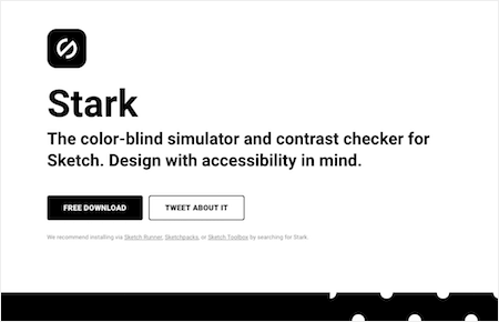
One in twelve men and one in 200 women are color blind. Our color choices, however, often aren’t made with them in mind. Contrasts are too low and content becomes hard or impossible to read. Stark simulates what your design looks like seen through the eyes of a color-blind person (eight color profiles are available to match different varieties of color blindedness) and the integrated color checker ensures that your colors, visuals and typography work hand in hand to offer a great reading experience — for everyone. Stark can be downloaded for free. (cm)
6. Italian Graphic Design At Its Best
What comes to your mind when you think of Italy? Pasta? Espresso? La dolce vita? Well, actually, Italy is the home of some real graphic design classics, household names like Massimo Vignelli, Giovanni Pintori, or Lora Lamm. The Archivio Grafica Italiana is dedicated to these gems and the stories behind them.
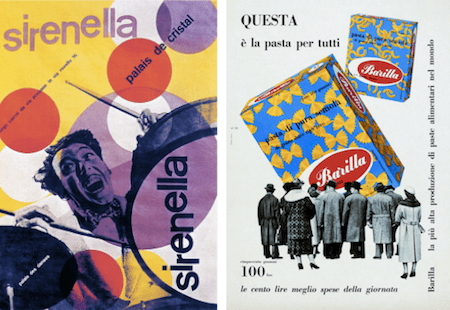
Scrolling through the archive feels like taking a trip back to the golden days of graphic design, when styles were simple yet the overall look bold and striking. The featured works — advertisements, posters, typefaces, logo and packaging design — date back mostly to the period between the 40s to the 70s, but you’ll also find some contemporary pieces in the collection. A great reminder that it doesn’t take sophisticated tools to create something memorable. (cm)
7. A Pure CSS Crossword
Last but not least, a nice little experiment to puzzle over. Literally. Adrian Roworth built a working crossword puzzle only with HTML and CSS. The accompanying Codepen lets you dive right into the code.
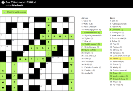
A cool feature: The crossword checks for valid squares in real-time as you type in your answer and even highlights the clues that refer to the field that is active at that point of time. Impressive! (cm)
Smashing Newsletter
Useful front-end & UX bits, delivered once a week. Subscribe and get the Smart Interface Design Checklists PDF — in your inbox. 🎁
You can always unsubscribe with just one click.
Previous Issues
- UX Mapping and Service Blueprints
- Designing Voice UX
- New CSS Features and Techniques
- Designing For Complex UIs
- Hidden Gems of the Web
- Web Performance 2026
- Designing Surveys
- Accessibility and Inclusive Design
- Interface Design Patterns
- UX Research Strategies and Tools
Looking for older issues? Drop us an email and we’ll happily share them with you. Would be quite a hassle searching and clicking through them here anyway.

