June 20, 2017 Smashing Newsletter: Issue #183
This newsletter issue was sent out to 228,882 newsletter subscribers on Tuesday, June 6th 2017.

Editorial
How difficult could it be to design the perfect accordion? For example, when it comes to designing one for collapsed table rows, cards or even for navigation in a UI? Well, it’s all about looking into all of those fine details of the design with an intent to match users’ expectations. Since there is no general convention about the design and interaction of an accordion, and accordions look and work differently across sites, some of your users will be confused about your experience no matter what you do.

Sometimes, a click on a particular category can lead directly to the category itself, while sometimes a tap on an empty space within the accordion’s bar does exactly nothing, so some users will almost instinctively click on the icon rather than on anything else. Obviously, there are still many things to consider:
- How do you style a category’s title?
- How do you indicate collapsed or expanded states, and what icons do you use to indicate these states?
- Where exactly do you place the icon, and what happens if users click on a category’s title, empty space and the icon?
- Should an expanded section collapse automatically?
- Should users be scrolled to the top when an accordion is expanded?
- Should you also have a “collapse all” or “open all” link or button?
While it’s in the nature of an accordion to collapse one card while another is being opened, it might be better to give users full control and leave the card open until the user chooses to close it. The same goes for not scrolling the navigation to the top whenever an accordion is expanded.
So what do we do then? Simple. Have the entire category’s title, empty space, as well as icon act as expansions. Use an icon that indicates the direction of an expansion (chevron) or at least the expansion (+). Change the icon when the state is toggled to indicate collapsing (reversed chevron, - or x). Since a tap on the category’s title acts as an expansion, add a link to the category in the list of items within the collapsible card. Place an icon on the left or on the right, and make sure it’s large enough for comfortable tapping (at least 44×44px). That’s probably the best we can do to match users’ expectations. In case they aren’t met, all navigation options are still there and can be accessed without an extra hassle or annoyance.
Ah, and by the way, I’ll be highlighting these issues and a couple of other patterns in my workshop at SmashingConf New York in the next week — I would love to see you there!
Table of Contents
- Tools For A Smoother HTML Email Workflow
- Lean And Accessible Controls
- Insights Into Freelancing
- Taking A Closer Look At WebView
- Tips For Working From The Road
- Customer Support With Slack
- Little Moments Of Happiness
- Daily Video Goodness
1. Tools For A Smoother HTML Email Workflow
“Technically it is front-end development, but it almost feels like a bizarro alternate universe.” That’s how Chris Coyier describes HTML Email, and, well, if you ever had to code an email yourself, you’ll probably agree that getting things right is not that easy. Not only are there hundreds of email clients to consider, but we also need ponder about simple stuff like padding or calc(), and whether they’re supported at all. To make your HTML email workflow at least a bit smoother, Chris Coyier has now collected some helpful tools that are worth looking into.
In Chris’ collection, you’ll find email templates to tinker with and build upon, UI builders that allow you to design and write emails without even touching any code, as well as sending tool APIs and testing tools. Inlining CSS tools are also on the list, even though inlining isn’t necessarily required anymore as most email clients finally support <style> blocks in the <head>. One for the bookmarks. (cm)
2. Lean And Accessible Controls
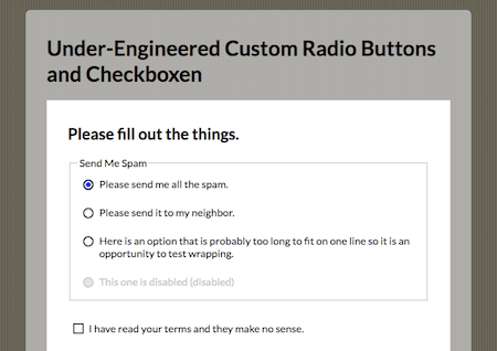
Style hooks, scripting, or images that need to be downloaded tend to make controls overly complex. But we can do better, as Adrian Roselli shows. He came up with a lean version of radio buttons and checkboxes, and the best part is that they are not only simple and semantic, but also accessible.
Adrian’s solution gets by with pure HTML and CSS only — no third-party libraries, images or scripting are involved. Relying on a simple markup of <input>, followed by <label>, keeps the styles simple, so if your CSS fails for some reason, you still have a fully functional, accessible field. Clever! (cm)
3. Insights Into Freelancing
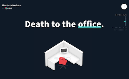
What will the future of independent work look like? And where are we today? AND CO, an app that supports freelancers in managing their business, attempted to find out, and surveyed 300 independent workers. The result: A better picture of what freelancing means today, a closer look at motivations, hurdles, and things that could be improved.
An interesting finding strikes right at the beginning: Freelancing is a conscious choice: Only 6% of the surveyed people said they’re only doing it until a full-time opportunity comes along. Also, 95% are what the survey calls “slash workers”, people who specialize in more than one service and skill. Reasons for going independent include personal growth, flexibility, and freedom, and in fact, 68% said that their quality of life has improved since they took the step.
But it’s not all roses either. 43% of the participants are financially less stable as before, according to the study, and gender inequality also plays a role for freelancers. Every second woman earned less than $25,000 a year compared to 34% men (their chance of earning $150,000+ is 4.5× higher as for women), and an alarming 44% of all freelancers has been stiffed by a client before. For more insights, take a look at the survey. (cm)
4. Taking A Closer Look At WebView
We all had to deal with WebView at some point, and, in fact, the way it works is actually quite simple: You use common web technologies to build the app, and a minimal, chromeless browser then runs it on the user’s device. You can even use native APIs and, with the help of frameworks like Apache Cordova, use native resources on the device (the camera, for example).
If you want to dive deeper into WebView, Jen Looper wrote an article in which she explains what WebView is all about and how it allows you to use web technologies to craft a mobile app. If you’re especially interested in creating WebView-based Android applications, a comprehensive article in the Chrome Developer blog has got your back. It walks you through the process of creating a new project and offers tips for an efficient WebView workflow and for crafting pixel-perfect UIs. Worth looking into. (cm)
5. Tips For Working From The Road
Good work can be done from almost anywhere. It doesn’t take much more as a quiet spot, a stable WiFi connection, and you’re ready to go. If you’re travelling a lot, you probably already have a good sense of finding places to sit back and get some work done. However, sometimes a tip from a local or from fellow remote workers can guide you to the little gems you wouldn’t have discovered otherwise — a nice coffee shop with quiet corners, enough power sockets and stellar coffee, for example, or a library with comfy armchairs and great WiFi.
To make sure you always find the best work-friendly spaces, no matter where you’re heading, Workfrom collects tips from over 1,250 cities and counting. A travel essential. But watch out, there’s a pitfall that could get in your way when working abroad: power plugs. Especially when the voltage and frequency used at your destination is different from the one your devices are using. So to prevent bad surprises, it’s a good idea to check if you’ll need a travel adapter or even a voltage converter before you hit the road. Better safe than sorry, right? (cm)
6. Customer Support With Slack
How do you handle communication with your customers or website visitors? Do you rely on email? Or maybe you have an extra app in place to do the job? Smallchat wants to make the undertaking more intuitive. By building upon a tool that a lot of us use already every day: Slack.
The idea is to use Slack’s new threads feature to help you streamline all your conversations in one single support channel. No need to add an additional app to the game, just use what you’re already using. To do so, you simply add a customizable embed widget to your site, and it’ll update automatically. There’s no limit when it comes to the number of conversations, operators or customers that Smallchat can handle. If you want to give it a try, Smallchat is free to use. Pro features such as customizable auto-messages or exporting email contacts are available in paid plans. (cm)
7. Little Moments Of Happiness
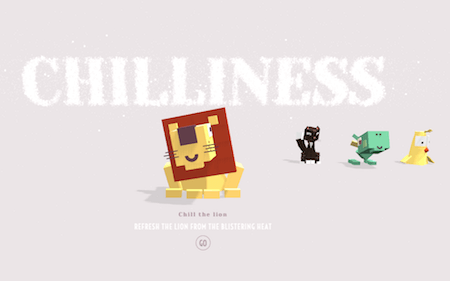
Did you ever cool off a lion with a fan? It might sound weird, but, well, we did. And what can we say? The lion loved it! The refreshing breeze made his mane dance and brought a big smile to his face. Don’t believe it? Well, go ahead, and try for yourself.
The lion is part of the WebGL project named “Moments of Happiness”, which was brought to life by EPIC Agency. He and five of his animal friends — a sneezing dragon, a playful cat, a paranoid bird, a valorous rabbit and a mighty fish — are bound to put a smile to your face, too, as you interact with them. To breathe life into the odd yet lovable bunch, the experiments use Three.js and the GSAP Library. If you want to take a closer look under the hood, the source codes are available on Codepen. Watch out, though: They are not fully optimized and might not work in some browsers or devices. (cm)
8. Daily Video Goodness
You’ve binge watched your favorite series and have run out of material? Or maybe you’ve always dreamt of making your own film? Then be sure to check out VOTD. VOTD stands for “voted”, and presents the first daily awards for videos. Eye candy guaranteed.
The idea behind VOTD is that video makers submit their videos (anything less than 5 minutes), and an audience along with a judge vote on it based on innovation, idea, execution and design. Once the video has been in the nominees for a week, its score will be calculated and compared with the videos from the previous 30 days. The one that scores highest, will become the Video Of The Day. Among the videos, you’ll find a lot of music videos, but also commercials and short films that are full of creative ideas and stunning visuals. Inspiring! (cm)
Smashing Newsletter
Useful front-end & UX bits, delivered once a week. Subscribe and get the Smart Interface Design Checklists PDF — in your inbox. 🎁
You can always unsubscribe with just one click.
Previous Issues
- UX Mapping and Service Blueprints
- Designing Voice UX
- New CSS Features and Techniques
- Designing For Complex UIs
- Hidden Gems of the Web
- Web Performance 2026
- Designing Surveys
- Accessibility and Inclusive Design
- Interface Design Patterns
- UX Research Strategies and Tools
Looking for older issues? Drop us an email and we’ll happily share them with you. Would be quite a hassle searching and clicking through them here anyway.


