August 29, 2017 Smashing Newsletter: Issue #188
This newsletter issue was sent out to 227,450 newsletter subscribers on Tuesday, August 15th 2017.

Editorial
One of the most common questions asked when hiring designers and developers is whether they have a side project or contribute to open source. In a way, it’s almost expected that a candidate is willing to spend their spare time on something that will keep them on their toes after working hours and weekends. For companies, that’s a sign that a candidate is willing to learn and improve things, rather than just work through 9 to 5. And so indeed many of us work on such projects: often not only to polish up our CVs, but to stay up to date with modern technologies, help others, scratch our own itch, and just get better at our work.
Think about the products, libraries and services you love and use every single day. Think about the people crafting those interfaces or maintaining those repos for all of us to use. They’re working hard and investing a lot of their limited time because they care. Yet, too often a lot of work goes unnoticed and uncredited. Support them. Drop them an email today saying “thank you”, give them a shout-out on Twitter or Facebook, recommend them to your friends and colleagues and total strangers. Or perhaps send them a little gift or a small donation.
It might not sound like a big deal, but it just might make someone’s day after a long weekend of redesigning a broken UI or fixing way too many bugs. Give them the motivation they need to keep going and improve something you use.
Cheers to all you hardworking folks out there!
Vitaly (@smashingmag)
Table of Contents
- Better Breadcrumbs The Scotch Egg Way
- Ready To Master New Challenges? SmashingConf Barcelona Is Coming!
- Freebie: Scaramella, A Typeface With A Story
- A Way Forward To More Meaningful Animations
- Flexbox And Grid Explained For Designers
- A Video Podcast To Learn Accessibility
- Safari About To Support Service Workers
- Style Encapsulation With Shadow DOM
1. Better Breadcrumbs The Scotch Egg Way
Do you remember the fairy tale about Hansel and Gretel and how they dropped breadcrumbs onto the forest ground to find their path back home? Well, on the web, breadcrumbs play a similar role. Breadcrumb navigation can improve how users find their way around by giving them a sense of where they are within a site’s structure. But not all breadcrumbs are equally helpful.
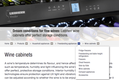
As Andy Beaumont points out, static breadcrumb menus often prevent users from finding something that is on the same level as an already open level. The solution: Scotch Egg Navigation. It allows the user to see all available options at each level of the hierarchy, thanks to a dropdown. This way, they can move to any point in that hierarchy without backing out and in again. If you want to see examples of what such user-friendly breadcrumbs can look like in action, check out the website of household appliance manufacturer Liebherr, or the navigation on the site of the Parisian-based school École Estienne. (cm)
2. Ready To Master New Challenges? SmashingConf Barcelona Is Coming!
The web is constantly changing. So, what could be better than learning first-hand from people who know their craft — Marcy Sutton, Brad Frost, Sarah Drasner, Chris Coyier and Monica Dinculescu, among others? Well, SmashingConf Barcelona is returning to the magical Palau de la Música Catalana once again this fall (Oct 17–18th) to boost up your skills. Two packed days of hands-on, practical sessions by some of the most respected members of the community.
Join us on our journey to the sunny Mediterranean seaside where we’ll explore new front-end challenges, UX strategies, and design patterns that you’ll be able to apply immediately to you work. No fluff or theory, just things that have worked in real-life projects — with enough time for networking, of course. Grab your ticket and see you there! (cm)
3. Freebie: Scaramella, A Typeface With A Story
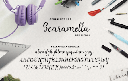
Scaramella. What a fine-sounding name. What’s hiding behind it, is a real goodie, too. With the idea in mind to create a free typeface for feminist projects, Scaramella was designed by Brazil-based designer Camilla Scaramella whose family name was passed down to her by two generations of women.
Scaramella shines with its unique handwriting style and comes in two versions: Regular and Brush. To let the connections between the letters flow as naturally as possible (which is one of the main challenges with handwriting typography), Camilla analyzed each and every letter carefully. And, well, the result speaks for itself. You can download Scaramella for free — and use it for non-feminist purposes, too, of course! (cm)
4. A Way Forward To More Meaningful Animations
Animation can be a powerful tool to enhance the user experience, but only if used carefully can they unleash their real power. Too much of it, on the other hand, might cause confusion or dislike.
To help us gain a better understanding of when animation makes sense, Roman Kalina summarized the three types of animation that actually bring benefits for the user: Animations that grab the user’s attention, animations to guide your users through your app and show them what to do, and, last but not least, the ones that are visually pleasing and cater for little sparks of delight. To help us get animation right, Roman also provides a four-point checklist with questions we should ask ourselves whenever we plan to use animation effects in a project. With these guidelines in mind, we can make animation a lot more meaningful. (cm)
5. Flexbox And Grid Explained For Designers
Here we go again. Without any doubt, Flexbox and CSS Grid have completely changed how we design for the web today by giving us entirely new possibilities to create the layouts we imagine — without weird hacks or workarounds. For designers, however, it might not always be that clear what the fuss is all about when they hear developers mentioning them in a conversation.
But no worries, Jon Yablonski’s “Designer’s Guide to Flexbox and Grid” sheds some light into the dark and explains everything designers (and devs who haven’t gotten a chance to get their hands dirty with the concepts yet) need to know about these transformational layout tools. Light-bulb moments guaranteed. (cm)
6. A Video Podcast To Learn Accessibility
According to the WHO, over a billion people have some form of disability — that’s 15% of the world’s population. With these figures in mind, it’s just about time to get a better grasp at accessibility as many of us are struggling with it. If you want to broaden your knowledge on accessibility, the Chrome Developers video podcast hosted by Rob Dodson is a good place to start.
22 episodes of A11ycasts have already been released, all of them between 5 to 12 minutes long, demonstrating real-world accessibility problems and solutions to fix them. Among other things, you’ll learn the basics of ARIA, how to check your project for accessibility, how screen readers work, and why semantics matter. Be sure to tune in. It’s worth it. (cm)
7. Safari About To Support Service Workers
A WebKit ticket and associated patch created by Apple Engineer Brady Eidson provoked collective glee in the web community. Apple is finally working on supporting service workers in Safari. Great news, especially since Service Workers are the foundation of progressive web apps.
Does that mean that Apple will fully support PWAs? Jason Grigsby points out that it’s too early to tell what these news actually mean for the full list of features that are part of the PWA definition. He also stresses that PWAs have always worked in Safari, so you shouldn’t wait on Apple to build one. Once service workers will be supported, Safari users will get an upgraded experience.
Speaking of PWAs, did you know that there’s a community-approved logo for them now? Peter O’Shaughnessy shares more details about how it came to be. (cm)
8. SVG Magic That’ll Leave You In Awe
You thought you knew SVG? Well, Sarah Drasner will teach you better. Her slides titled “SVG can do THAT?!” are full of SVG experiments that bend the rules of what we thought is possible with scalable vector graphics. From extraordinary UI elements to stunning animations that are not only interactive but also responsive, the slides are a treasure chest full of SVG inspiration.
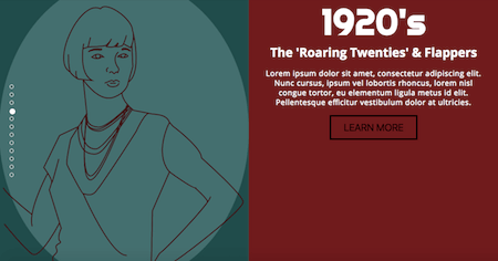
Along the way, Sarah will take you on a journey through fancy SVG techniques and animation effects and unravel the secret behind SVGs that draw themselves. The presentation is also a great way to discover some real SVG artists and their works. Have you heard of Sullivan Nolan, for example? Her morphing SVG slider uses SVG to paint women of the 20th century. Stunning! (cm)
9. Style Encapsulation With Shadow DOM
A small and snappy page is the ideal of what we all are striving for. Something that gets by without a lot of code but relies on reusable components instead. To keep your code as simple and fast as possible, encapsulated styles can do wonders. And to make them happen without any external tools, there’s no getting around Shadow DOM, as Monica Dinculescu argues.
Shadow DOM hasn’t been around for too long yet, but it comes with a mighty power: It encapsulates the CSS and markup you bundle with your implementation, hiding the implementation details of your elements. To help you wrap your head around the concept and understand why it might be a more elegant solution as faking style encapsulation with CSS Modules or <iframe>, for example, be sure to check out Monica’s blog post. Watch out, though: Since Shadow DOM is still a relatively new spec, older browsers might need a polyfill. (cm)
Smashing Newsletter
Useful front-end & UX bits, delivered once a week. Subscribe and get the Smart Interface Design Checklists PDF — in your inbox. 🎁
You can always unsubscribe with just one click.
Previous Issues
- UX Mapping and Service Blueprints
- Designing Voice UX
- New CSS Features and Techniques
- Designing For Complex UIs
- Hidden Gems of the Web
- Web Performance 2026
- Designing Surveys
- Accessibility and Inclusive Design
- Interface Design Patterns
- UX Research Strategies and Tools
Looking for older issues? Drop us an email and we’ll happily share them with you. Would be quite a hassle searching and clicking through them here anyway.


